Grid lines (or "zebra striping") in Message list view?
In Thunderbird 115 (Supernova) is there a way to configure the Message list view so that it has grid lines, or "zebra striping"? I find it easier visually to look at.
Thanks!
All Replies (14)
Tried to do this with the new supernova version and it wont show the zebra striping. has anyone been able to make it work with todays new TB version? thanks
I'm running 115.3.1 and it worked for me. But I was more interested in changing the background color and couldn't figure out how to merge the commands and make the two of them work together.
For zebra striping, I show two options, one for white background and one when using dark theme.
First, if not already done, Go to settings>general, scroll to bottom for config editor. Search for toolkit.legacyUserProfileCustomizations.stylesheets and set to True Then in profile, create a folder named chrome, if not already there Then, create a text file named userChrome.css if not already there Then, place one of the following in the file. Close TB if running and restart. Feel free to twiddle with the colors, but do not ask me for help in that. This is an area of personal experimentation. But it works. Good luck.
/* for WHITE background ver 115 plus */
/* ####### */
@namespace html url("http://www.w3.org/1999/xhtml");
- threadTree tr:nth-child(2n) {
background-image: linear-gradient(rgba(0,0,0,.08), rgba(0,0,0,.08)) !important;
}
- separator line - do not include ########
/* #### for ver 115 version and DARK theme */
@namespace html url("http://www.w3.org/1999/xhtml");
- threadTree tr:nth-child(2n) {
background-image: linear-gradient(rgba(255,255,255,.15), rgba(255,255,255,.15)) !important;
}
Seems like this is a feature that people appreciate, it's also found in other mailers as a standard preference. Would it make sense to simply have this as a preference setting in Thunderbird?
I can't get this to work either. And agree it should be brought back or be a simple setting in TB.
Thanks - the css code works about 90% of the time - I say this because I set it up exactly as instructed and now have another W10 computer where the css file does not work. So I have put this on about 16 computers and on two it doesn't work - one a dell E7470 laptop - the other an ASUS desktop. All my boxes are configured about the same way but clearly I am missing something. Works fine on 14 but not these two.
Okulungisiwe
Well, assuming you created one userControl.css file and copied to each PC, that leaves checking to see if config editor is properly updated and the chrome folder is properly named and in profile.
David - I agree completely - all the elements are in the right place - in my case across all computers - works in 90% of them but not in the two problem children. I haven't been able to figure it out yet..
Is it possible that the difference between computers where this works vs. those where it doesn't lies in whether one did a 100% fresh install of 115 vs. an upgrade from 102? That is some remnant code in 102 is interfering? I recognize this is an empirical question and I can do the experiment but thought to ask first before wasting time. Thanks.
All I can suggest is to post a screenshot of profile and one of chrome folder and one of prefs.js, since I assume the userChrome.css was copied from PCs where it is working. All the screenshots would do is help verify spelling.
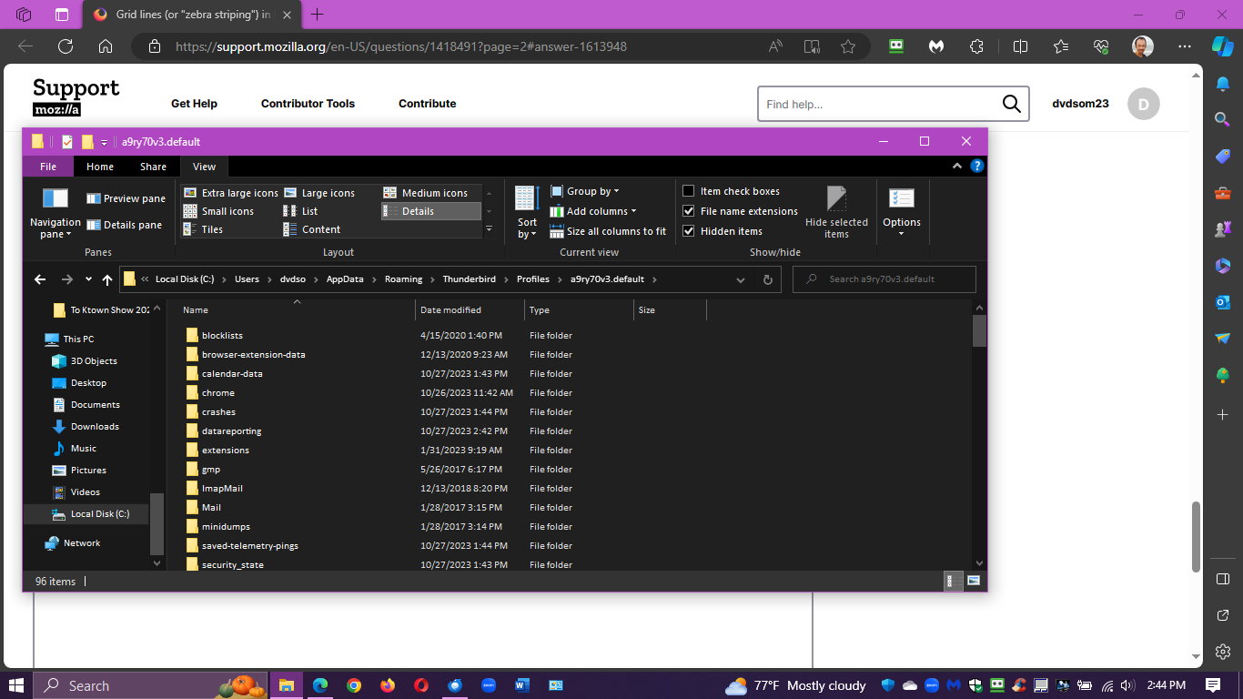
Here is text from mu userChrome.css file from a computer where grid lines are not working. Toolkit legacy etc set to true. Chrome folder label in upper or lower case c made no difference. Not sure how prefs.js file affects this? Image of folder structure is below. Played around with colors and transparency a lot made no difference.
/* for WHITE background ver 115 plus */ /* ####### */ @namespace html url("http://www.w3.org/1999/xhtml");
- threadTree tr:nth-child(2n) {
background-image: linear-gradient(rgba(250,100,200,.25), rgba(50,100,50,.35)) !important;
}
Thanks.
My concern for prefs.js is that it would confirm the config setting. That's why I requested it. There appears a '1' in your CSS, but that may just be a formatting error of the forum. I presume you copied a working version to the ones that don't work. Here is my setting again.
/* for WHITE background ver 115 plus */
/*  #######    */
@namespace html url("http://www.w3.org/1999/xhtml");

#threadTree tr:nth-child(2n) {
  background-image: linear-gradient(rgba(0,0,0,.08), rgba(0,0,0,.08)) !important;
}
Thanks David - yes the number 1 is a typo - actual file has the # sign at start of the line. And yes using the same css file as works on other boxes.


