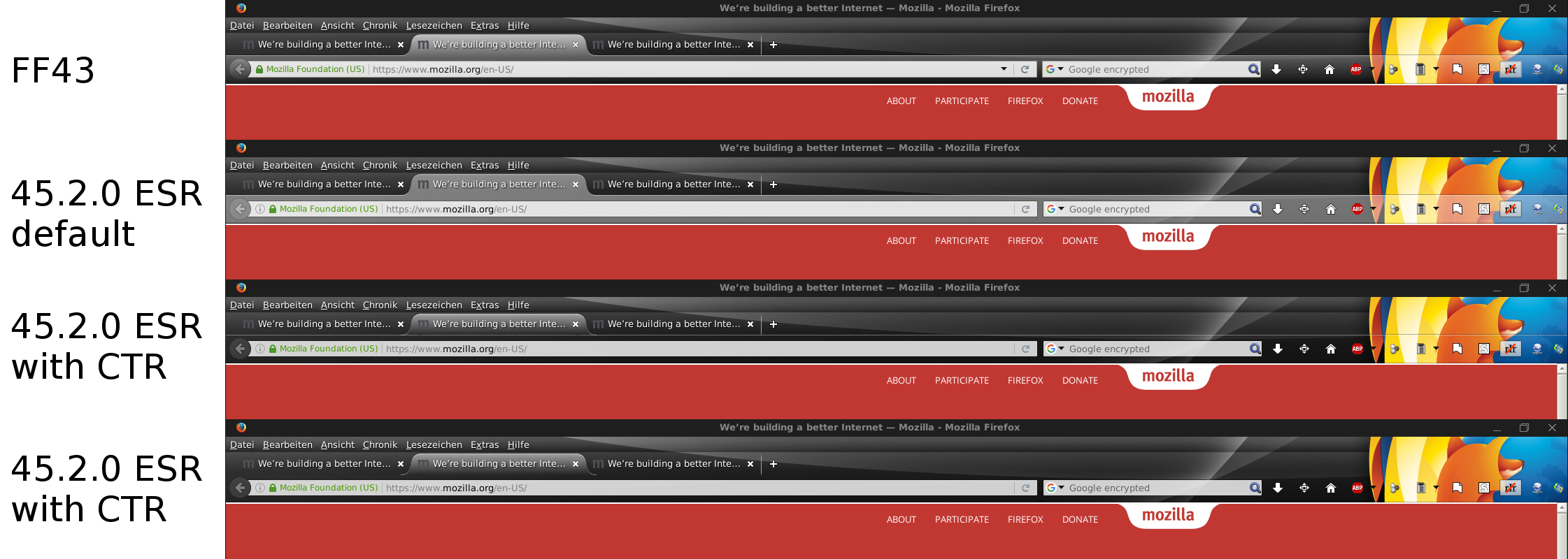
Remove background of tabs after ff43
Hi,
I recently updated from FF43 to FF45 ESR (since Firefox is now in the Debian repos again).
Somehow, this changed the behavior of the top panels which have had a light gradient in FF43 and now have a strong white color.
I really want it to be like it was before since the new style doesn't go well with the theme I'm using (https://addons.mozilla.org/de/firefox/addon/new-darkfox-tail-twister/).
I tried to sort of revert it with Classic theme restorer which lets me override the background of the tabs and remove the background of the nav bar, but I can either chose between (1): The border of the nav bar goes right through the tab which looks weird, or (2): There is no border for the nav bar which looks weird as well.
How can I fix this?
Gekose oplossing
These problems are a little tricky to solve. If the CTR look isn't optimal, you might try modifying the gradient using a custom style rule. Custom style rules can be applied to Firefox's UI using either the Stylish extension or a userChrome.css file.
The style rule used on Windows 7 is:
#nav-bar { background-image: linear-gradient(rgba(255,255,255,.4), transparent) !important; }
Screen shot attached for reference. That's probably more similar to your Firefox 43 appearance, or perhaps someone can go back into the older source code and find the actual style rules for Firefox 43 in Linux.
Lees dié antwoord in konteks 👍 1All Replies (4)
Gekose oplossing
These problems are a little tricky to solve. If the CTR look isn't optimal, you might try modifying the gradient using a custom style rule. Custom style rules can be applied to Firefox's UI using either the Stylish extension or a userChrome.css file.
The style rule used on Windows 7 is:
#nav-bar { background-image: linear-gradient(rgba(255,255,255,.4), transparent) !important; }
Screen shot attached for reference. That's probably more similar to your Firefox 43 appearance, or perhaps someone can go back into the older source code and find the actual style rules for Firefox 43 in Linux.
Gewysig op
You may not like Firefox 46.0 and newer as it requires GTK 3.4 (three.four) or preferably newer GTK for Firefox to run. As a result you need a GTK3 theme to theme Firefox as GTK2 themes does not work and will make Firefox look unthemed and arrows is missing on scroll bars.
Gewysig op
jscher2000 said
These problems are a little tricky to solve. If the CTR look isn't optimal, you might try modifying the gradient using a custom style rule. Custom style rules can be applied to Firefox's UI using either the Stylish extension or a userChrome.css file. The style rule used on Windows 7 is: #nav-bar { background-image: linear-gradient(rgba(255,255,255,.4), transparent) !important; } Screen shot attached for reference. That's probably more similar to your Firefox 43 appearance, or perhaps someone can go back into the older source code and find the actual style rules for Firefox 43 in Linux.
Thank you! That solved it perfectly. It doesn't look exactly like in FF43, but it may even like this design better.
James said
You may not like Firefox 46.0 and newer as it requires GTK 3.4 (three.four) or preferably newer GTK for Firefox to run. As a result you need a GTK3 theme to theme Firefox as GTK2 themes does not work and will make Firefox look unthemed and arrows is missing on scroll bars.
I actually tried out FF46 and the UI bugs are horrible. My theme remained though. In Debian testing / unstable we actually have GTK 3.2; 3.4 is not even released as stable yet. Is there even any distro which can run Firefox 46 at the moment? I guess, since I am using ESR, I still have a little time, and I hope that GTK 3.4 will distribute to the testing repos when they upgrade the Firefox version…
Oh, it seems that I confused 3.2 with 3.20, so nevermind!
It is probably the XFCE theme that I am using that prevents me from using FF46, but this was off-topic to begin with.


