How to get rid of the > sign and curved arrow in inbox pane?
I am running TB 115.8 on two separate Macs. On one Mac the inbox does not show the curved arrow and > sign along the left margin while the other does. I want to eliminate it on the Mac that shows them. How do I do it?
Gekose oplossing
Thank you sfhowes!! The css approach worked perfectly. I appreciate all the help.
Lees dié antwoord in konteks 👍 0All Replies (9)
And there is no subfolder to the Inbox? Can you post a screen shot?
Here are a couple of screen shots of this issue. The first shows the inbox on Mac #1 running TB 115.8 with the inbox formatted like I want it. Simply showing the Subject column in the left most position and no > or bent arrow to its left. The second screen shot shows Mac #2, again running TB 115.8, with the > and bent arrow in the first two column.
There does not appear to be an option to rid these two items from the inbox in the second instance.
any suggestions?
This area is called the message list pane. See https://support.mozilla.org/en-US/kb/getting-started-thunderbird-main-window-supernova
> There does not appear to be an option to rid these two items from the inbox in the second instance.
There is not. These items are needed to expand and collapse message threads.
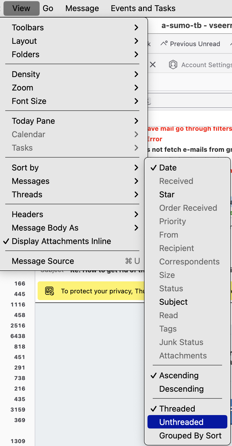
Set View/Sort by to Unthreaded. Press Alt if the Menu Bar with View is hidden.
Thanks sfhowes for the tip. I was able to delete the thread > icon. However, I still would like to eliminate the arrows. To be honest, I do not even know what they are used for, or their meaning.
There must be a way to do this as I am running TB 115.8.0 on both my Macs and as my screen shots show one of them does not have those icons and one does. I have checked and rechecked all my settings and they appear to be the same on both Macs.
How about css chrome or config?
The ONLY way they legitimately go away is what sfhowes stated.
Wayne Mery, I agree that sfhowes tip did get rid of the > icon, but he did not address the issue with the little arrows, which I still do not understand what their purpose is.
Not withstanding the above, I still cannot reconcile that fact that, as shown in my screen shots, the 2 Macs each running TB 115.8.0, display the message pane differently. One has the arrows and the other does not. That is proof to me that their must be a setting that eliminates/adds the arrows, otherwise how do we explain that they are present on one Mac and not the other?
If you means the coloured arrows to the left of the Subject, they indicate the message has been replied to (points to left) or forwarded (points to right). It is possible to modify them with css, or to hide them entirely, but most users keep them once they know their significance.
Gekose oplossing
Thank you sfhowes!! The css approach worked perfectly. I appreciate all the help.


