

Context menus now have no borders
Running thunderbird 101.0b1
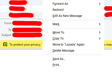
Context menus (right click menus) have no visible borders and are indistinguishable from the email body.
Image is attached.
الحل المُختار
Okay I've discovered that if you use the 'light' theme the user experience is basically black on white with no differentiation of anything.
I switched to the 'system' theme to get menu borders back and then had to clean up some stuff in userchrome to stop my screen from being a sea of white.
There are:
No alternating-background-colour rows in either in the folderview or message view. It's just text and white.
No menu borders.
No context borders.
It's just black text on white.
Stop doing this. Nobody likes it. If you don't want to distinguish rows with alternating background colours then use semitransparent borders. Use something. Create borders between context areas such as menus and non-menu text.
This *weird thing* where everything is just black text on white with no context borders anywhere on the page is just terrible terrible terrible UI. Take it back to where you found it.
userchrome.css: (remove the backslashes if you're pasting - this matches the system or light theme)
treecol, .treecol-image { -moz-appearance: none !important; border-bottom: 1px solid black !important; background-color: #D1D1D1 !important; }
\#folderTree > treechildren::-moz-tree-row(odd) {
background-color: #F0F3F7 !important;
}
\#folderTree > treechildren::-moz-tree-row(selected) {
background-color: #2292D0 !important;
}
\#threadTree > treechildren::-moz-tree-row(odd) {
background-color: #F0F3F7 !important;
}
\#threadTree > treechildren::-moz-tree-row(selected) {
background-color: #2292D0 !important;
}
Read this answer in context 👍 0All Replies (3)
الحل المُختار
Okay I've discovered that if you use the 'light' theme the user experience is basically black on white with no differentiation of anything.
I switched to the 'system' theme to get menu borders back and then had to clean up some stuff in userchrome to stop my screen from being a sea of white.
There are:
No alternating-background-colour rows in either in the folderview or message view. It's just text and white.
No menu borders.
No context borders.
It's just black text on white.
Stop doing this. Nobody likes it. If you don't want to distinguish rows with alternating background colours then use semitransparent borders. Use something. Create borders between context areas such as menus and non-menu text.
This *weird thing* where everything is just black text on white with no context borders anywhere on the page is just terrible terrible terrible UI. Take it back to where you found it.
userchrome.css: (remove the backslashes if you're pasting - this matches the system or light theme)
treecol, .treecol-image { -moz-appearance: none !important; border-bottom: 1px solid black !important; background-color: #D1D1D1 !important; }
\#folderTree > treechildren::-moz-tree-row(odd) {
background-color: #F0F3F7 !important;
}
\#folderTree > treechildren::-moz-tree-row(selected) {
background-color: #2292D0 !important;
}
\#threadTree > treechildren::-moz-tree-row(odd) {
background-color: #F0F3F7 !important;
}
\#threadTree > treechildren::-moz-tree-row(selected) {
background-color: #2292D0 !important;
}
Modified by bugzilla5
Use the system theme if you prefer a border. Otherwise, I think it's a design change and some will say it's cleaner without the border. I'm not defending it, but that's what it seems to be.
david said
I'm not defending it, but that's what it seems to be.
I really do wonder these days. I really do.
Look even at this website for an example. I've selected a 'chosen solution' and the site has encased that in box to hilight and bring attention to it, to differentiate it. Shows a clear understanding of the use and benefit of borders and differentiation. Between this reply and your reply? A horizontal border.
In the programs themselves? Nothing!
Modified by bugzilla5