Firefox new design - Poor
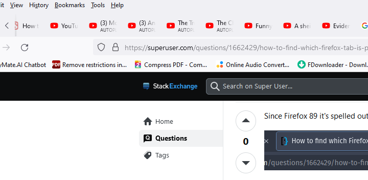
Firefox changed the design on tabs and other features some time back. The whole user experience has been worse since the UX design was changed. For example, it's impossible to find out without going through tab after tab, which one is active and playing. I wish there was an option to reverse back to the old design.
All Replies (3)
Hi,
The people who answer questions here, for the most part, are other users volunteering their time (like me), not Mozilla employees or developers. If you want to leave feedback for developers, you can go to the Firefox Help menu and select Share ideas and feedback…. Alternatively, you can use this link. Your feedback gets collected by a team of people who read it and gather data about the most common issues.
You can also file a bug report or feature request. See File a bug report or feature request for Mozilla products for details.
You might want to use an extension like Media Controller.
See also the "List all tabs" drop-down panel (down pointing arrow on the tab bar).

