Thunderbird 115: combine menu and "unified" toolbar?
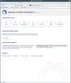
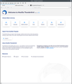
[Thunderbird 115 on Ubuntu 20.04, KDE/Plasma 5.18]
In my previous version of Thunderbird (possibly 70+?) I had a menu bar (with "File", "Edit", etc) that also included some icons with functions such as "write", "search", and similar, that I used frequently. To be honest I don't remember if this could be achieved simply by "Customize..." or with some add-on.
Now in TB 115 there's a separate menu bar and a "unified" toolbar where those icons have been moved. Is there any way to move those icons & functions back to the menu bar, and remove the unified toolbar? Or vice versa: move the menu in the unified toolbar. It's a pity with the waste of vertical space.
I know that the unified toolbar has a sort of menu ("hamburger menu", the three horizontal bars, on the right), but this menu is not as convenient as the menu bar, which for example has an "Edit" menu, which I don't find in the "hamburger menu".
Cheers!
All Replies (11)
Consideration is being given to the idea of a merged menu/unified toolbar
re: I know that the unified toolbar has a sort of menu ("hamburger menu", the three horizontal bars, on the right), but this menu is not as convenient as the menu bar, which for example has an "Edit" menu, which I don't find in the "hamburger menu".
The Menu app icon (3 lines) is not exactly very useful and in my opinion was never a handy or easy to use as the 'Menu Bar'. After the redesign it's lost a huge amount of functionality, but it still can enable the Toolbars.
- Click on 'Menu app icon' and click on 'View' to see options.
- Click on 'Toolbars' and click to select 'Menu Bar'.
Then you will discover the 'Menu Bar' is not in the correct location. If like loads of other people you find this wrong then use the info at the following link to put Menu Bar back on top.
Modified
Toad-Hall said
The Menu app icon (3 lines) is not exactly very useful and in my opinion was never a handy or easy to use as the 'Menu Bar'. After the redesign it's lost a huge amount of functionality, but it still can enable the Toolbars.
- Click on 'Menu app icon' and click on 'View' to see options.
- Click on 'Toolbars' and click to select 'Menu Bar'.
15 years ago the app menu industry standard was more like, try to list most functions in the app menu. But for reasonable reasons (to not overwhelm the menus) not everything was listed there.
Now, the standard is, less in the app menu, more stuffed into context menus or features offered closer to the area of UI in which you are operating. Arguably, this is the way it should have been day one.
But you should still be able to do everything via menus
Toad-Hall said
'After the redesign it's lost a huge amount of functionality, but it still can enable the Toolbars.
- Click on 'Menu app icon' and click on 'View' to see options.
- Click on 'Toolbars' and click to select 'Menu Bar'.
Thank you for these instructions. My specific "problem" or request is to have menu and various icons in one bar only, rather than two. This was possible in previous TB versions. But from Wayne's answer it looks like they're working on this.
Wayne Mery said
Consideration is being given to the idea of a merged menu/unified toolbar
Thank you for the info! Glad to hear the Team is working on this :)
pglpm said
Toad-Hall said
'After the redesign it's lost a huge amount of functionality, but it still can enable the Toolbars.
- Click on 'Menu app icon' and click on 'View' to see options.
- Click on 'Toolbars' and click to select 'Menu Bar'.
Thank you for these instructions. My specific "problem" or request is to have menu and various icons in one bar only, rather than two. This was possible in previous TB versions. But from Wayne's answer it looks like they're working on this.
I have been knocking around the Thunderbird community for more than 10 years and I am not aware of there ever being a combined menu and toolbar, even as an addon. I do not claim to be an encyclopedia on what was available. But I have never heard of it.
You might want to have a look here https://support.mozilla.org/en-US/questions/1418752#answer-1591505 as that topic discusses the location of the menu bar above the unified toolbar.
Matt said
I have been knocking around the Thunderbird community for more than 10 years and I am not aware of there ever being a combined menu and toolbar, even as an addon.
I reinstalled Thunderbird 102.15. Enclosed you find a snapshot of how it looks like. You can see the Menu bar, and beside its menu entries I've added the icons for "Compact folder", "Contacts", and "Calendar" . I could add others if I wanted to (say "Delete", "Reply", or whatnot). It's neat, versatile, and uses very little vertical space.
This customization feature was built-in in Thunderbird 102.15 (and many versions before it); no add-ons needed. I enclose one more snapshot in which you see that I can drag icons into the Menu bar via the "Customize..." option.
It's sad that the Thunderbird Team removed customization capabilities. I'll simply revert back to TB 102, even if it's costing me setting up my profile from scratch, unfortunately. That version was working fine and the user interface was less clumsy.
Luckily I had a backup of the previous profile, so I was able to "down"grade without creating it from scratch. I enclose a snippet of how it looked (and thankfully again looks) like. Even the spacing between the folders in the Folders pane was nicer than the 115 version. I'll wait and update when/if the team will develop a less clumsy interface :)
pglpm said
Luckily I had a backup of the previous profile, so I was able to "down"grade without creating it from scratch. I enclose a snippet of how it looked (and thankfully again looks) like. Even the spacing between the folders in the Folders pane was nicer than the 115 version. I'll wait and update when/if the team will develop a less clumsy interface :)
I downgraded as well - 102 was a much better interface, however Mozilla automatically downloads 115 and invites you to 'upgrade'. Even if you keep ignoring this, my laptop crashed and automatically installed the upgrade at start-up, now I am back with 115 - beware mozilla will get you onto 115, regardless of your wishes!
The only solution I can see is keep raising the issue and campaign for the unified toolbar to be a switchable option rather than being forced upon us.
> however Mozilla automatically downloads 115 and invites you to 'upgrade'.
- Settings > General
- scroll to 'Updates' section
- Select 'Check for updates but let me choose whether to install them'
- Uncheck - do not select - 'Use a background service to install updates
The first selection means Thunderbird may check for an update but you have the choice to say no, so it does not download anything. The second uncheck option means Windows UAC controls will not allow an update without additional OK command. So, if by accident you click on install, then another Windows UAC window pops up asking if you want to allow an install - say No. This applies if it is Thunderbird performing the update.
However, please be aware that many people have found their Thunderbird is getting an auto update despite having those settings and this means it is not Thunderbird doing the update. If you have updater sofware on your computer then it may be looking for updates for programs on your computer and updating/overriding the settings in Thunderbird and whats more that updater program may have the UAC auto allowing the update. Some Anti-Virus programs have this option auto enabled. Please check your computer to see if you have another program which is controlling updates to various installed programs.
Modified
nigel38 said
Even if you keep ignoring this, my laptop crashed and automatically installed the upgrade at start-up, now I am back with 115 - beware mozilla will get you onto 115, regardless of your wishes!
If you are using an apt-based installation (e.g. Ubuntu or Debian), you can set priority for version 102, so that it isn't updated. See for instance <https://fostips.com/ubuntu-21-10-two-firefox-remove-snap> and <https://ubuntuhandbook.org/index.php/2021/02/set-package-ppa-apt-repository-priority-ubuntu>. I have this in a file within /etc/apt/preferences.d/
# set higher priority for Thunderbird 102
Package: thunderbird*
Pin: version 1:10*
Pin-Priority: 600


