menu bar background colour
Would anyone know the UserChrome,css code to change the colour of menu bar in attached image? I've had a look with dom inspector & got the id as toolbar-menubar
Userchrome entry have already tried, which does not seem to do anything... toolbar-menubar {background: #d3daed !important;}
Previously using a theme to change the appearance but this stopped working after FF28
Zvolené řešení
got it CTR setting under Toolbars(3) had got add background colour (os title bar) tabs not on top enabled doh This has generated a small line below the file menu which I can live with. This brings me close enough to appearance of FF 3.6 which I liked
Přečíst dotaz v kontextu 👍 0Všechny odpovědi (9)
Hi -Chris- it looks like the image didn't attach. Could you attach it to a reply? Thanks.
https://support.mozilla.org/questions/1108862#question-reply
image
Wow, I don't even recognize that browser!
On my Windows 7 Aero-based theme, the menu bar background ends immediately after the word Help, with the background color assigned to the #main-menubar element. I think whatever add-on you are using to customize the toolbar area may have its own style rules overriding the default approach.
Is it Classic Theme Restorer or something similar? In that case, please check whether its options include a way to put a transparent background behind the menu bar.
If not, try transparent as the color in your custom style rule, and style the elements up and down the hierarchy in case the rule you need to override is there:
#toolbar-menubar, #menubar-items, #main-menubar {
  background-color: transparent !important;
  background-image: none !important;
}
Can you find it?
(P.S. to post code in a reply, insert an extra space at the beginning of each new line)
why thank you for the unrecognised browser comment yep classic theme restorer is installed (as is classic toolbar buttons & a few others). tweaked you code by removing transparant element so it no reads
#toolbar-menubar, #menubar-items, #main-menubar {
 background-color: #d3daed !important;
 background-image: none !important;
} which has changed the background behind file menu, exit etc. Any way to extend the colour into space to right of help menu??
Upravil uživatel -Chris- dne
updated image
Can you use DOM Inspector to discover what other element is behind the menu bar? If it's not clear, I would work from the outside in, starting with #navigator-toolbox and drilling down from there.
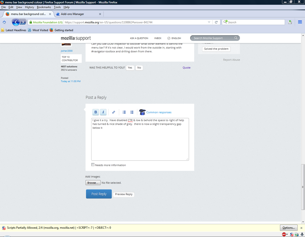
I give it a try. Have disabled CTR & low & behold the space to right of help has turned & nice shade of grey. there is now a slight transparency gap below it
Zvolené řešení
got it CTR setting under Toolbars(3) had got add background colour (os title bar) tabs not on top enabled doh This has generated a small line below the file menu which I can live with. This brings me close enough to appearance of FF 3.6 which I liked
For comparison attached is image of FF 3.6 vs 43
Upravil uživatel -Chris- dne


