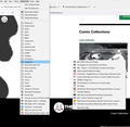
Bookmark menu
Is there anyway to restore the format (compactness) of the Bookmark Menus without setting the Automatic Updates to not automatically update and then downloading the 88.0.1 version? I hate to not have the Automatic Updates, for obvious reasons, but don't want to use the double space of the Bookmarks even more.
Todas las respuestas (12)
This wider menu item spacing is a feature of the Firefox 89 "Proton" redesign. I can give you a quick short-term workaround, but a more durable solution will require more work.
Temporary Fix -- for Firefox 89-90 ONLY
For testing purposes, there is a preference to switch between new style and old style menus. It helps with the spacing, but might be a tad bit glitchy:
(1) In a new tab, type or paste about:config in the address bar and press Enter/Return. Click the button accepting the risk.
(2) In the search box in the page, type or paste browser.proton.contextmenus.enabled and pause while the list is filtered
(3) Double-click the preference to switch between true (new style) and false (old style)
You might need to do a regular exit/restart of Firefox to fully implement this change. In my test, the Bookmarks menu on the optional top Menu Bar was messed up in the existing window, but looked okay in a new window.
Longer Term Community Workaround
This involves setting up a userChrome.css file. The full instructions are in the following thread: https://support.mozilla.org/questions/1337841
I'm sure we'll refine that during the course of the month so when the temporary preference is removed, it will be airtight.
Modificadas por jscher2000 - Support Volunteer el
I also had this problem - on my laptop it meant the bookmarks took up a lot of the vertical space. Your solution of "browser.proton.contextmenus.enabled" worked for me.
Thank you.
Alan
One small issue. When the menu is displaying the 'compressed'm format, the horizontal size seems to be fixed, not matter how wide the actual text of individual menu items is. Sub menus are displayed in their correct location, so there is now a gap between a menu and its sub-menu.
Is this something that can be fixed? The picture shows what I mean.
Alan
Hi Alan, did you already do a normal exit/restart of Firefox? As mentioned in my earlier reply, there may be glitches with changing this setting in the middle of your session.
Oops - silly me.
Yes, it's OK on my main PC now. I'll check my laptop later today.
cheers
Alan
All sorted.
thanks
Alan
It's stopped working. I've set up a userchrome.css as instructed but the menus are still wide apart. I've closed off all FF windows and restarted - still no joy. I'm running FF version 91.0. Did something break for that version?
I checked after another restart and the browser.proton.contextmenus.enabled is set to False.
Alan
Modificadas por alan.sharkey el
Update - I enabled a userchrome.css and it has worked.
Alan
The 'toolkit' fix no longer works, as we were warned it wouldn't. I've spent a couple of hours trying to work the .css file but I'm no techie so I can't fix it this way.
Glad to say I've found another fix: change to Vivaldi. Thanks Firefox but you're so clever you baffle us basic users.
Jim,
I can send you my .css file if that helps. The instructions in the links above worked for me.
Vivaldi is nice, but has some background issues that made me return to Firefox.
Alan
Thank you Alan, I followed the links and got someone else to check them as we went but it still won't work. Vivaldi is meeting our fairly simple needs but how sad that FF ignores so many requests to leave the spacing alone -- or at least give the option of reverting to it. I'm beginning to see why people are leaving FF which I always thought was the best for privacy and security ...
Following above post I came across this definition on a broadband forum with a thread on this line spacing issue. I think sums up the slow death of Firefox: “The ultimate fate of all open-source software is death by too many cooks.”


