Long ago we were able to drag a larger new bookmark dialog box & I'm wondering if we'll ever be able to do that again?
The "NEW bookmark" dialog box is stupid small & difficult to navigate. Once we could drag it bigger, but not any more. Can we have that capability again, & could FFox remember the size during subsequent reboots? Keep up the good work! PG
Valitud lahendus
For those features, you need the Add Bookmark Here² add-on.
Loe vastust kontekstis 👍 0All Replies (10)
Valitud lahendus
For those features, you need the Add Bookmark Here² add-on.
I added it & it seems useful, but it's not what I'm looking for as the view of the folders is not much bigger, if any. As I remember the very old "New bookmark" interface, I could fill the screen with it. Thanks for the link, though!
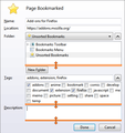
See the screenshot - just drag the display larger where the orange lines are. That view size should persist over time.
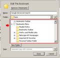
I wasn't aware that that was possible. Thank you. I'm not sure how to attach an image, but the "new bookmark dialog box" that I'd like to enlarge is this one:
https://support.cdn.mozilla.net/media/uploads/images/thumbnails/2014-05-22-20-28-13-e3d48d.png
That doesn't look like a screenshot of the "Edit this Bookmark" dialog with Add Bookmark Here² installed; then again I don't use that extension any longer. I just drag'n'drop the "new bookmark" into the sidebar bookmarks folder that I want the new bookmark in.
Maybe the screenshot that I grabbed from AMO downloads page as an example for Add Bookmark Here² is different for Firefox 29?
[quote]Maybe the screenshot that I grabbed from AMO downloads page as an example for Add Bookmark Here² is different for Firefox 29?/quote
What I see in FFox 29.0.1 is the same as the image you showed me.
I wish that I could remember when it was possible to drag that box bigger. It might have even been back in WIn98.
Muudetud
PhotosGuy wrote:
the view of the folders is not much bigger, if any.
- Click the ≡ Menu Button and choose Add-ons.
- Click Extensions on the left.
- Next to Add Bookmark Here², click the Options button.
- Click the Panel icon.
- Make sure the following items are checked: Name, Location, Folder, Expand the Folder Tree. Close the options window when done.
- Visit any web page and double-click the ★ Star Icon.
- Expand the folder tree so that the subfolders are visible. If needed, vertically resize the list of folders, the tags box and description box as pictured in the previous screenshot.
- Place the bookmark in any folder, then click the Done button. The next time you open either the Edit Bookmark or Page Bookmarked pop-ups, they'll appear as they were when you last closed them.
the-edmeister wrote:
Maybe the screenshot that I grabbed from AMO downloads page as an example for Add Bookmark Here² is different for Firefox 29?
Just some minor cosmetic differences like the lines being blue on my operating system.
Muudetud
"Expand the folder tree so that the subfolders are visible. If needed, vertically resize the list of folders, the tags box and description box as pictured in the previous screenshot." All the items were checked, & the folder tree seems to be at maximum & can't be vertically resized any more, so it's still much smaller than the old working interface that I remember. Thanks for trying to help, though!
If you want the list of bookmark folders to be as tall as possible, uncheck all unneeded items like Tags, Keyword, Description and so on.
Muudetud
YES! It's not as large as we used to be able to get it, but it's a definite improvement! Thank you!


