Tabs Below Address Bar - Firefox 89.0
Could someone please provide userChrome.css which puts the tabs back below the Address Bar in Firefox 89.0?
All the other solutions I've found end up putting the tabs at the bottom of the window where the status bar is. It becomes translucent and the + button cannot be found.
I had one userChrome.css which did put the tabs below; however, the whole top of the browser went to the bottom of the screen so the Menu Bar, Address Bar, and then the Tabs appeared below the page being viewed.
Has anyone found a version that keeps the status quo but just moves the tabs to where they should be?
Thanks.
Muudetud
Valitud lahendus
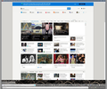
Hi Photoparity, your buttons look extra-tall. Are you using "Touch" as your Density selection? I think most solutions are designed for Normal or Compact, so definitely some values will need to be tweaked with Touch density. If you want to experiment with a different density, it is set on the Customize tab (or you can use about:config).
- Customize Firefox controls, buttons and toolbars
- about:config values: https://www.userchrome.org/firefox-89-styling-proton-ui.html#compactmode
All Replies (5)
HERE IS THE CORRECT ANSWER for Firefox version 9.00 of how to achieve it now edited into my very first question https://support.mozilla.org/en-US/questions/1339095
Muudetud
When I used your solution I have run into an issue.
As I create new tabs they extend to only half the browser window. As they are created, they only take up a limited amount across the top.
I've attached an image to provide an example.
How do I get this to extend to the full space of the browser window?
Thanks
I managed to get the tabs to extend across the full window. Now there's another problem.
How do I get the tabs bar to match the height of the tab specified?
Photoparity said
I managed to get the tabs to extend across the full window. Now there's another problem. How do I get the tabs bar to match the height of the tab specified?
Hi Photoparity . . . it took me ages to get mine right (as you can see from the number of questions and replies in that thread). I had to keep altering the heights on mine, by altering this information below, (if that helps). It was originally suggested to me to use a smaller number, but when I did the menu was squeezed up and no address-bar showing, so I set mine to 45px
You can modify the 45px in this line below, if you wish to get an appropriate height . . just experiment with different numbers till you get it right --menubar-height: 45px; /*30px|41px=11px; caption buttons on menubar*/
Valitud lahendus
Hi Photoparity, your buttons look extra-tall. Are you using "Touch" as your Density selection? I think most solutions are designed for Normal or Compact, so definitely some values will need to be tweaked with Touch density. If you want to experiment with a different density, it is set on the Customize tab (or you can use about:config).


