[SOLVED] How can I remove empty spaces next to icons and reduce line spacing?
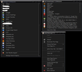
In my context menu, bookmarks, the search, (basically everywhere) there are a lot of empty spaces on both sides of any icons - how can I use userChrome.css to get rid of them?
Also - in my Searchbox and the context menus the line spacing is way too big. I found css snippets to adjust them for my Bookmarks already, but haven't been able to find any for context menus and search box.
The top right image shows the line spacing how I want it to be, the others show how it looks now - and they all have the empty spaces on both sides of any icons.
Any help/css snippet is appreciated, if all else fails I'd also take a userstyle or an addon :)
Modified
All Replies (13)
Hi Nimueh, it sounds like you are familiar with style rule modifications, so I may not need to go over all the gritty details. Note that extensions (including those that apply user styles to web pages) are not currently able to make these kinds of changes.
Search Bar Drop-Down
What rules are you using to convert the grid style to the list style?
If you are restyling the native layout, you can tighten the spacing by reducing the margins on the search engine icon, for example:
#PopupSearchAutoComplete .searchbar-engine-one-off-item[tooltiptext] > .button-box > .button-icon { margin-top: 2px !important; }
(e.g., from my Firefox Search Bar Show Engine Names – userChrome.css Style Builder with the "Narrow" vertical spacing option)
However, if you are substituting a block of new code (e.g., using Classic rules), you will need to explore the selectors used in that code.
Context Menus
I don't know why your items (line-height?) are so widely spaced, and I don't immediately see how to override it. Maybe try:
Whoops, I now see you are using Firefox 52 ESR. Since you can use legacy extensions, obviously they can do anything.
Actually, your browser calls itself Cyberfox. Their forums are here: https://8pecxstudios.com/Forums/index.php
Yes I am using Cyberfox - Firefox didn't leave me any choice when the new versions changed the whole searchbar layout and even its behaviour and now not even Classic Theme Restorer can fix it.
Your CSS code works when I turn off the old style search in CTR - but then I have the new, unwanted behaviour back that as soon as I select a search provider that search opens in a new tab. With the old style I can select it, THEN enter my text and go search for it. I need to use different search URLs at least 50 times/day, so I'm not willing to use the new search as that would cost me a lot of extra time.
Thanks for replying though :)
It sounds like should have asked as what your talking about re search does not happen. It performs as it always did select a search and use it in the same window.
The way it works now (with Cyberfox and Classic Theme Restorer): I select a search provider, type my query and hit enter - THEN it opens the search, not when I select the provider.
That's how I want it and how I've always had it, it's much easier (for me) to use than the way FF does it now ;)
Hi Nimueh, with the new bar, you have to change your work flow a bit:
Scenario #1: Submit query to current default search engine
Unchanged: Type your query, and submit using Enter or the arrow button
Scenario #2: Submit query to a different search engine
(A) Changing your default search engine going forward
- Before Firefox 34
- Drop the list and left-click an icon to set a new default
- Type your query, and submit using Enter or the arrow button
- Since Firefox 34
- Drop the list and right-click > Set As Default Search Engine to set a new default (extra click)
- Type your query, and submit using Enter or the arrow button
(B) Without changing your default search engine ("one-off search")
- Before Firefox 34
- Not possible
- Since Firefox 34
- Type your query
- Left-click a search engine icon to submit your query to that site
I have a video comparison and styling makeover demo here: https://vimeo.com/245639066
Yea, you're missing the point though ;)
I don't want to change my workflow - I do way too many searches on different sites every day and having to change how I've been doing it for 15-ish years is simply out of the question. It would take much more time than it does now and that's not an option, sorry ;)
Old habits die hard. Best of luck to you with your new browser.
Thanks
I ended up switching to Waterfox and ditching the "Theme Tweaker" add-on and now everything is, does + looks like it's supposed to ... search boxes + context menu, all back to normal.
Case closed ... for me at least :)
Yea ... because using a smaller, slimmer fork is worse than putting up with the newfangled crap FF got over the years *rolls eyes*.
FF ESR no longer gets security updates anyway, so using Waterfox that "might" get them 2 weeks later than the regular FF is still better than getting none at all.

