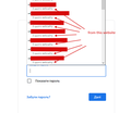
How Can I Remove the "From This Website" Line From the Password Dropdown
Hey,
When entering a password on some website, I have a dropdown list of all saved passwords for this website and every saved password has the "from this website" line under it. This makes the dropdown list extremely long (in terms of its height).
I would love to get rid of the sign "from this website", so that I see a more compact list of saved passwords without those useless lines "from this website".
I have already turned off the "signon.includeOtherSubdomainsInLookup" feature, all that is left to make the dropdown list of passwords look normal (just like it used to be before all the new pointless changes).
I hope more experienced firefox users can help me make my browser more user-friendly to me.
Chosen solution
Note: I don't think this is good idea if you allow Firefox to show saved logins from subdomains, so this would be if you have set signon.includeOtherSubdomainsInLookup to false.
*** Update ***
As pointed out by TyDraniu, there is a preference for this:
(1) In a new tab, type or paste about:config in the address bar and press Enter/Return. Click the button accepting the risk.
(2) In the search box in the page, type or paste signon.showAutoCompleteOrigins and pause while the list is filtered
(3) Double-click the preference to switch the value from true to false
*** Original Solution ***
There's no official solution, but as a community-supported workaround, you can use a custom style rule in a userChrome.css file to hide those labels. I wish I could find a way to hide only the "matching" (same origin) labels and show the others -- that would be more useful for me. But to hide all of them:
/*** Saved Login Autocomplete: Hide hostname line ***/
richlistitem[originaltype="loginWithOrigin"] .line2-label {
  display: none !important;
}
Are you familiar with the optional userChrome.css file?
Read this answer in context 👍 1All Replies (6)
I don't use autocomplete, but instead right-click and use "Use Saved Login" to select the username and password. That line is shown in the source as a 'comment' and I'm not sure if there is a way to hide it as this content is created via JavaScript.
Chosen Solution
Note: I don't think this is good idea if you allow Firefox to show saved logins from subdomains, so this would be if you have set signon.includeOtherSubdomainsInLookup to false.
*** Update ***
As pointed out by TyDraniu, there is a preference for this:
(1) In a new tab, type or paste about:config in the address bar and press Enter/Return. Click the button accepting the risk.
(2) In the search box in the page, type or paste signon.showAutoCompleteOrigins and pause while the list is filtered
(3) Double-click the preference to switch the value from true to false
*** Original Solution ***
There's no official solution, but as a community-supported workaround, you can use a custom style rule in a userChrome.css file to hide those labels. I wish I could find a way to hide only the "matching" (same origin) labels and show the others -- that would be more useful for me. But to hide all of them:
/*** Saved Login Autocomplete: Hide hostname line ***/
richlistitem[originaltype="loginWithOrigin"] .line2-label {
  display: none !important;
}
Are you familiar with the optional userChrome.css file?
Modified
Thank you cor-el and jscher2000 and for your answers!
jscher2000, that's the exact solution I was hoping to find. Perfect. Thank you so much!
I used your method for moving tabs bar below the address line, so I'm familiar with the userChrome.css file.
BTW, where do you find the names of the classes, ids, etc. of various firefox elements (like "richlistitem[originaltype="loginWithOrigin"] .line2-label" in this case)?
seosashko said
BTW, where do you find the names of the classes, ids, etc. of various firefox elements (like "richlistitem[originaltype="loginWithOrigin"] .line2-label" in this case)?
I use the Browser Toolbox's Inspector tool. It works similarly to the Page Inspector but for the user interface elements. It's difficult working with popups because when you stop them from hiding, they stay in the way of all your open windows. But... it's better than nothing!
I used your method for moving tabs bar below the address line
Firefox 89 has a major UI refresh, so you'll need new code in June. I haven't started working on that yet, but others are already on the case. https://www.reddit.com/r/FirefoxCSS/
What about the signon.showAutoCompleteOrigins pref?
TyDraniu said
What about the signon.showAutoCompleteOrigins pref?
That is much easier. Why didn't I see that when I reviewed the list? I don't think "origins" clicked with me.

