Ce site disposera de fonctionnalités limitées pendant que nous effectuons des opérations de maintenance en vue de vous proposer un meilleur service. Si un article ne règle pas votre problème et que vous souhaitez poser une question, notre communauté d’assistance est prête à vous répondre via @FirefoxSupport sur Twitter, et /r/firefox sur Reddit.

Rechercher dans l’assistance

Évitez les escroqueries à l’assistance. Nous ne vous demanderons jamais d’appeler ou d’envoyer un SMS à un numéro de téléphone ou de partager des informations personnelles. Veuillez signaler toute activité suspecte en utilisant l’option « Signaler un abus ».

En savoir plus

Reorganize message pane possible?

  • 1 réponse
  • 0 a ce problème
  • 1 vue
  • Dernière réponse par sfhowes

more options

Hello, got auto-updated to 115.3.1 yesterday ( :-( ); and it was a pig. Slow, unreactive, loth of blank tabs - just awful. And it "updated" my profile so I couldn;'t roll it back :-( I have used Thunderbird for many years; so was might peeved at having to do web-based Gmail again. Today, took a different view, and downloaded 119.0.b2. Used profile manager to create a new (old) profile. Seems to be better than Release channel.

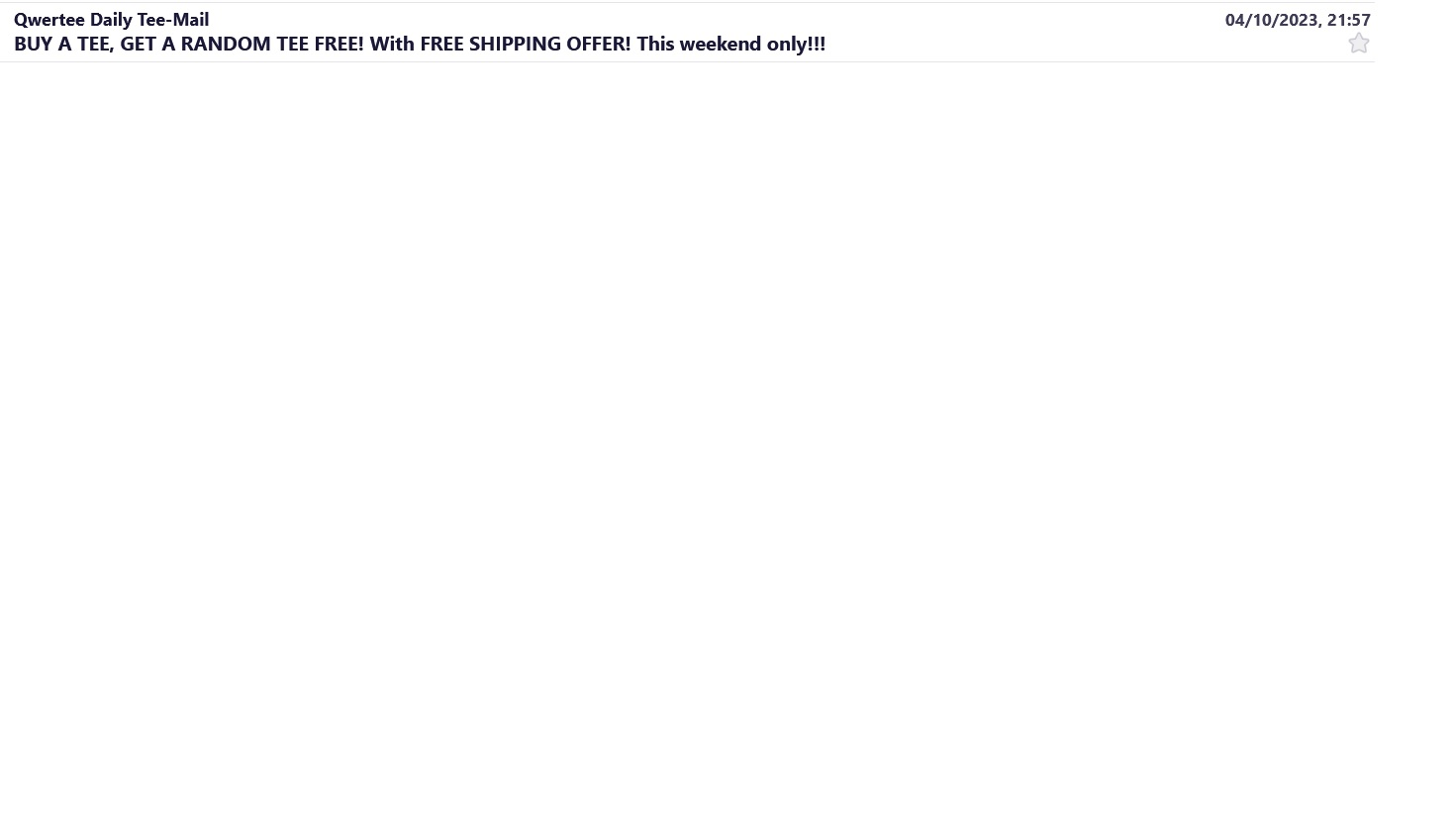
But in the message pane, it's default is to display the sender on a line above the message header. Can I revert to the "old tabular" display with a column for the sender and another column for the message header? This would it make messages SO MUCH EASIER to scan through (as they were before). I can't find any such option in menus. Attached is a "new" format example, I would like the sender split in a tabular way from the message title.

Many thanks in advance.

Hello, got auto-updated to 115.3.1 yesterday ( :-( ); and it was a pig. Slow, unreactive, loth of blank tabs - just awful. And it "updated" my profile so I couldn;'t roll it back :-( I have used Thunderbird for many years; so was might peeved at having to do web-based Gmail again. Today, took a different view, and downloaded 119.0.b2. Used profile manager to create a new (old) profile. Seems to be better than Release channel. But in the message pane, it's default is to display the sender on a line above the message header. Can I revert to the "old tabular" display with a column for the sender and another column for the message header? This would it make messages SO MUCH EASIER to scan through (as they were before). I can't find any such option in menus. Attached is a "new" format example, I would like the sender split in a tabular way from the message title. Many thanks in advance.
Captures d’écran jointes

Toutes les réponses (1)

more options

Enable the Message List Header under View/Layout, then click the icon next to the Quick Filter button to select Table View.