Folders behavior customization?
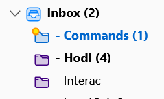
Hey guys. With my previous Tbird install, subfolders had 3 different looks to them. There was a folder icon for subfolders with no unread emails, and other icon for folders with unread emails, and an other subfolder icon for a subfolder with new unread email. But the image included shows the new updated version folders I get. The subfolder "HODL" and the subfolder "Interac" look identical, though one of them contains unread emails (4) and the other one does not.
This is a very important feature for my script to work properly. I can't find where in the settings or with add-ons how to make it so.
This is likely frivolous to most of you, but extremely important to me.
How can I get subfolders with unread emails to look different?
Or maybe I could revert to the earlier version?
Moambuepyre
Opaite Mbohovái (7)
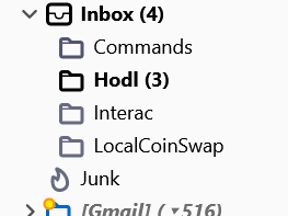
I ignored your last statement on your last topic because Thunderbird does not and never has to my knowledge ever used different icons on folders depending on if they contains unread mail or not. It uses special icons for special folders such as is shown below. It also changes the colours depending if the folder has focus or not, or in come cases when there is unseen mail in a folder. It also adds a badge when the folder has unseen mail (yellow star).

I have a feeling your script is based on an incorrect assumption, but I really don't know.
It's okay. I managed to find a work around. But my script was working fine for the last 8 months until I updated Tbird. And indeed for the last 8 months, folders with unread emails would look different than folders with all read emails. The borders of the folder picture were made fatter when it contained at least one unread email. I'll see if I can dig up and old screenshot.
This question sounds like a continuance of this question: https://support.mozilla.org/en-US/questions/1404319
Pleae note: when you start a question, it is helpful if you continue the same conversation in the intitial question - unless it was created several weeks ago and all comments stopped.
You stated this in that original question asked only four days ago. I designed a script to automate a large part of my computer work. This script relies heavily on how folders look and behave. My folders used to have a different color when there are unread messages in it. But it's no longer the case.
But your image clearly shows the Commands (1) folder and folder name is a different colour when it receives new mail.
Now you say : The borders of the folder picture were made fatter when it contained at least one unread email. This has never been the case, the folder icon has never got thicker outline, but the folder name text is fatter - it becomes bold.
You say: The subfolder "HODL" and the subfolder "Interac" look identical, though one of them contains unread emails (4) and the other one does not.
By default: New mail in a folder since you last accessed folder in this session, will turn folder a blue colour. It will also display a gold/yellow star icon on the folder icon. The folder name font changes to blue text in Bold eg: Commands (1) If you selected that 'Commands' folder, the new unread email will also display a gold star at start of Subject.
Your image confirms that works as expected on the Commands folder.
If folder has unread mail, but not new mail this session or since you last accessed the folder. Folder icon will be the default colour or whatever colour you have set the folder to use. Folder name will be bold font, the text colour is Black indicating no new unread mail, only unread mail. This is shown in your image, I can see that the 'Hodl' folder name is using Bold text, so I instantly know it has unread mail and it has brackets with a number (4) which tells me how many unread emails are in that particular folder.
The 'Interac' folder is not Blue, so no new unread mail. Folder name is not bold regardless of colour, so it has no unread mail.
All your folders appear to be easily understood as to what has new unread or old unread or no unread emails. Nothing appears to be amiss.
Running a test in Light mode
A folder with newly downloaded unread mail this session but not accessed since last download will be coloured Blue - it will display a small gold star on folder icon and it will have the folder name text coloured blue, it will also be bold and display number of unread mail.
When you open that folder, the 'sort by read' column will display all unread mail with a green dot and any that are new that session will also have a gold star icon at the start of Subject. This means you can instantly see what is previously downloaded mail and what is the newly downloaded mail this session since you last selected the folder.
As you select to open and read previously download unread mail, the number in the folder () brackets will decrease. If you select the new email with star icon, then the star icon on folder will disappear and the folder name itself will change from Blue to Black and if there are still some unread messages, the font will remain bold.
If folder has no unread mail then the folder name font is not bold - it's normal font coloured black. There are no () brackets, indicting no unread mail.
All exactly the same as your image.
However: The only issue which I am able to create is when I have new mail filtered to a particular folder. Folder font turns bold and I get brackets showing an unread mail, which is good. BUT, folder icon is not Blue, the folder name font is Black (not Blue as expected) and there is no gold star icon - not on folder and not in list of new mail. So, at this point I have no idea whether the unread mail is old or new.
Noticed the filter was performing 'filter after junk classification'. This particular quirk may not be intended and therefore a bug, so I'll report that in Bugzilla.
FIX: edited filter - changed to 'filter before junk classification' and then all new mail is properly identified - folder turns blue, foldername is Blue and Bold and gold star visible on folder icon and on new mail.
So if you are saying that you have a problem which is this: The 'Hodl' folder really does have a new unread mail auto filtered into that 'Hodl' folder since you last selected that folder. But it's is not turning Blue etc when it gets new mail, - it just looks like you have only old unread mail.
Please check the Message Filter as it may have a setting 'Filter after junk classification' which needs to be set as 'filter before junk classification'.
Moambuepyre
Quote: This has never been the case, the folder icon has never got thicker outline, but the folder name text is fatter - it becomes bold.
I'm sorry but this is wrong. In the past, I had 3 kinds of subfolders: normal folder for no unread mail, fatter/darker folder if it contains at least one unread email, and blue folder if it contains a new unread email. I don't have a screen of the later one. But here is a screen of the first two types of folders.
pepelapiu said
Quote: This has never been the case, the folder icon has never got thicker outline, but the folder name text is fatter - it becomes bold. I'm sorry but this is wrong. In the past, I had 3 kinds of subfolders: normal folder for no unread mail, fatter/darker folder if it contains at least one unread email, and blue folder if it contains a new unread email. I don't have a screen of the later one. But here is a screen of the first two types of folders.
I also have some images of that phase (after solid colour folder icons and before current outline multicolour) and none of my folder icons are bold when they contain unread emails - only the foldername. If folder had new unread then it changed colour to blue, but was not bold.
Your images show a change of colour from a grey to a black for unread. Maybe you used an addon or userChrome.css file.
Question : do you use a 'userChrome.css' file ?
If yes then this code - shown between the lines below - can change the inner colour of the folder icon, so it retains the same outline colour but fills with eg: black = #000000 It does make the folder stand out.
treechildren::-moz-tree-image(folderNameCol, hasUnreadMessages-true){
moz-appearance:none !important; fill: #000000 !important;
}
If you do not know how to create and use a userChrome.css file then let me know and I'll provide more info.
"Question : do you use a 'userChrome.css' file ?" No, I have no add-ons installed and I don't know what a userChrome.css eats during mating season.
But it's okay. The problem is solved. I actually found a work around that makes my script more responsive and more robust. I just wanted to correct the idea that a thicker or darker folder for unread mail has never been the case. Because it has, at least in my ecperience.
OK But just in case anyone needs it, I've now come up with how to change the actual folder colour for unread. eg: black = #000000
treechildren::-moz-tree-image(folderNameCol, hasUnreadMessages-true){
stroke: #000000 !important;
}


