

3D CSS Perspective no longer working in Firefox 56.
Posted this on StackExchange as well...
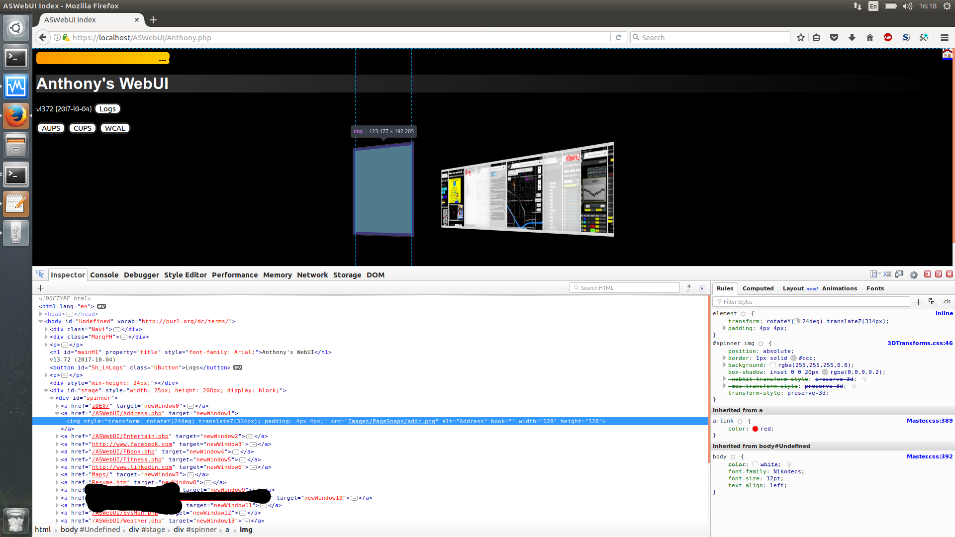
A year ago or so I created some 3D CSS animations. They are now no longer working after upgrading to Firefox 56. The preserve-3D appears to no longer be functioning, as the 3D elements all appear as one flat rotating line. More interestingly, if you go to the Developer Tools you can actually see the placeholder for the 3D element spinning around in 3D, but it just doesn't do it in the view port.
- Filtered out a few IPs/ URLs for privacy.
Here is my code:
HTML:
<div id='stage' style='width: 25px; height: 208px; display: block;'>
<div id='spinner'>
<a href=zDEV/ target='newWindow0'>
<img width=128 height=128 style='transform: rotateY(0deg) translateZ(314px); padding: 4px 4px;' src='Images/PageSnaps/ZDEV.png' alt=(Development)>
</a>
<a href=/ASWebUI/Address.php target='newWindow1'>
<img width=128 height=128 style='transform: rotateY(24deg) translateZ(314px); padding: 4px 4px;' src='Images/PageSnaps/addr.png' alt=Address Book>
</a>
<a href=/ASWebUI/Entertain.php target='newWindow2'>
<img width=128 height=128 style='transform: rotateY(48deg) translateZ(314px); padding: 4px 4px;' src='Images/PageSnaps/entr.png' alt=Entertainment>
</a>
<a href=http://www.facebook.com target='newWindow3'>
<img width=128 height=128 style='transform: rotateY(72deg) translateZ(314px); padding: 4px 4px;' src='Images/PageSnaps/face.png' alt=Facebook>
</a>
<a href=/ASWebUI/FBook.php target='newWindow4'>
<img width=128 height=128 style='transform: rotateY(96deg) translateZ(314px); padding: 4px 4px;' src='Images/PageSnaps/fina.png' alt=Finance Book>
</a>
<a href=/ASWebUI/Fitness.php target='newWindow5'>
<img width=128 height=128 style='transform: rotateY(120deg) translateZ(314px); padding: 4px 4px;' src='Images/PageSnaps/fitn.png' alt=Fitness>
</a>
<a href=http://www.linkedin.com target='newWindow6'>
<img width=128 height=128 style='transform: rotateY(144deg) translateZ(314px); padding: 4px 4px;' src='Images/PageSnaps/lnkn.png' alt=LinkedIn>
</a>
<a href=Maps/ target='newWindow7'>
<img width=128 height=128 style='transform: rotateY(168deg) translateZ(314px); padding: 4px 4px;' src='Images/PageSnaps/leaf.png' alt=Local Map Server>
</a>
<a href=Resume.htm target='newWindow8'>
<img width=128 height=128 style='transform: rotateY(192deg) translateZ(314px); padding: 4px 4px;' src='Images/PageSnaps/resu.png' alt=Resume>
</a>
<a href=/ASWebUI/SysMon.php target='newWindow12'>
<img width=128 height=128 style='transform: rotateY(288deg) translateZ(314px); padding: 4px 4px;' src='Images/PageSnaps/snmp.png' alt=System Monitor>
</a>
<a href=/ASWebUI/Weather.php target='newWindow13'>
<img width=128 height=128 style='transform: rotateY(312deg) translateZ(314px); padding: 4px 4px;' src='Images/PageSnaps/wxlv.png' alt=Weather>
</a>
</div>
</div>

CSS:
@keyframes spinner {
	from {
		-webkit-transform: rotateY(0deg);
		-moz-transform: rotateY(0deg);
		transform: rotateY(0deg);
	}
	to {
		-webkit-transform: rotateY(-360deg);
		-moz-transform: rotateY(-360deg);
		transform: rotateY(-360deg);
	}
}

#stage {
	margin: 1em auto;
	-webkit-perspective: 1200px;
	-moz-perspective: 1200px;
	perspective: 1200px;
	-webkit-perspective-origin: 0 50%;
	-moz-perspective-origin: 0 50%;
	perspective-origin: 0 50%;
}

#spinner {
	display: block;
	-webkit-animation-name: spinner;
	-webkit-animation-timing-function: linear;
	-webkit-animation-iteration-count: infinite;
	-webkit-animation-duration: 10s;
	animation-name: spinner;
	animation-timing-function: linear;
	animation-iteration-count: infinite;
	animation-duration: 10s;
	-webkit-transform-style: preserve-3d;
	-moz-transform-style: preserve-3d;
	transform-style: preserve-3d;
	-webkit-transform: rotateZ(0);
	-moz-transform: rotateZ(0);
	transform: rotateZ(0);
}

#spinner:hover {
	animation-play-state: paused;
}

#spinner img {
	position: absolute;
	border: 1px solid #ccc;
	background: rgba(255,255,255,0.8);
	box-shadow: inset 0 0 20px rgba(0,0,0,0.2);
	-webkit-transform-style: preserve-3d;
	-moz-transform-style: preserve-3d;
	transform-style: preserve-3d;
}
השתנתה ב־ על־ידי cor-el
כל התגובות (2)
I see that other thread is very quiet: https://stackoverflow.com/questions/46556163/preserve-3d-no-longer-working-in-firefox-58
Do you want to file a bug? https://bugzilla.mozilla.org/enter_bug.cgi
Did you try Firefox 57 Developer Edition or 58 Nightly to see if that fixes this issue?