

Image elements out of position FF 77.0.1
Hi,
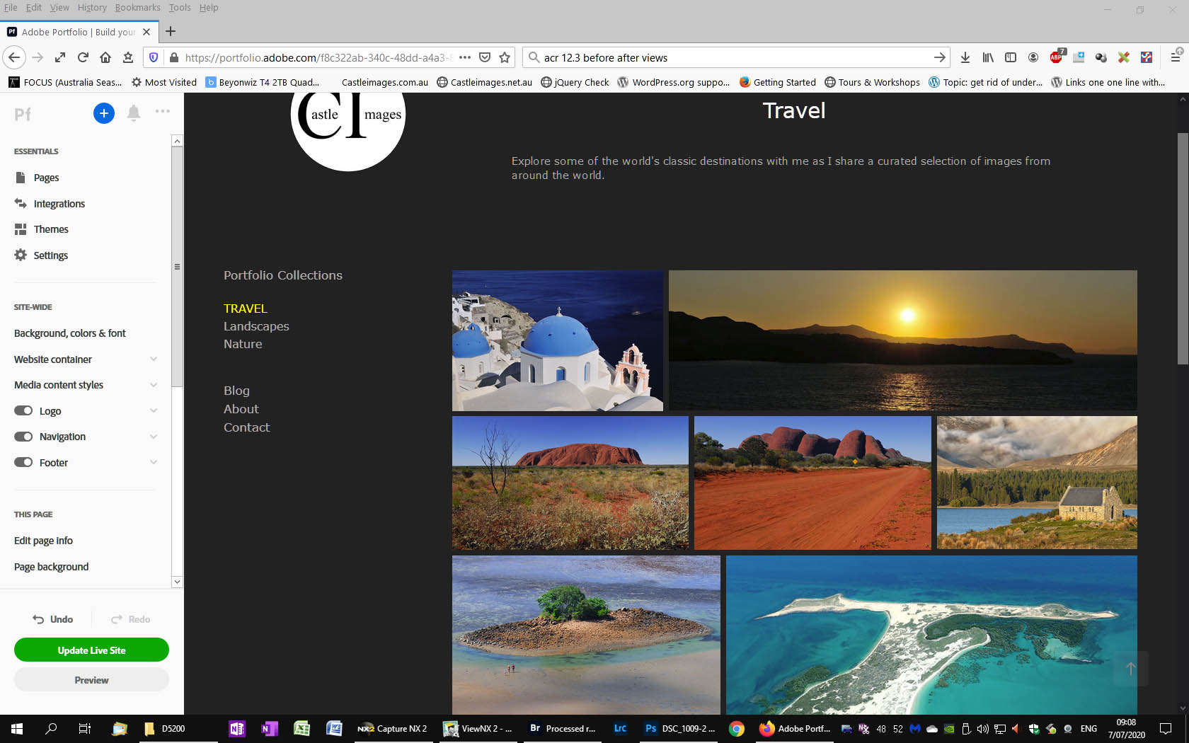
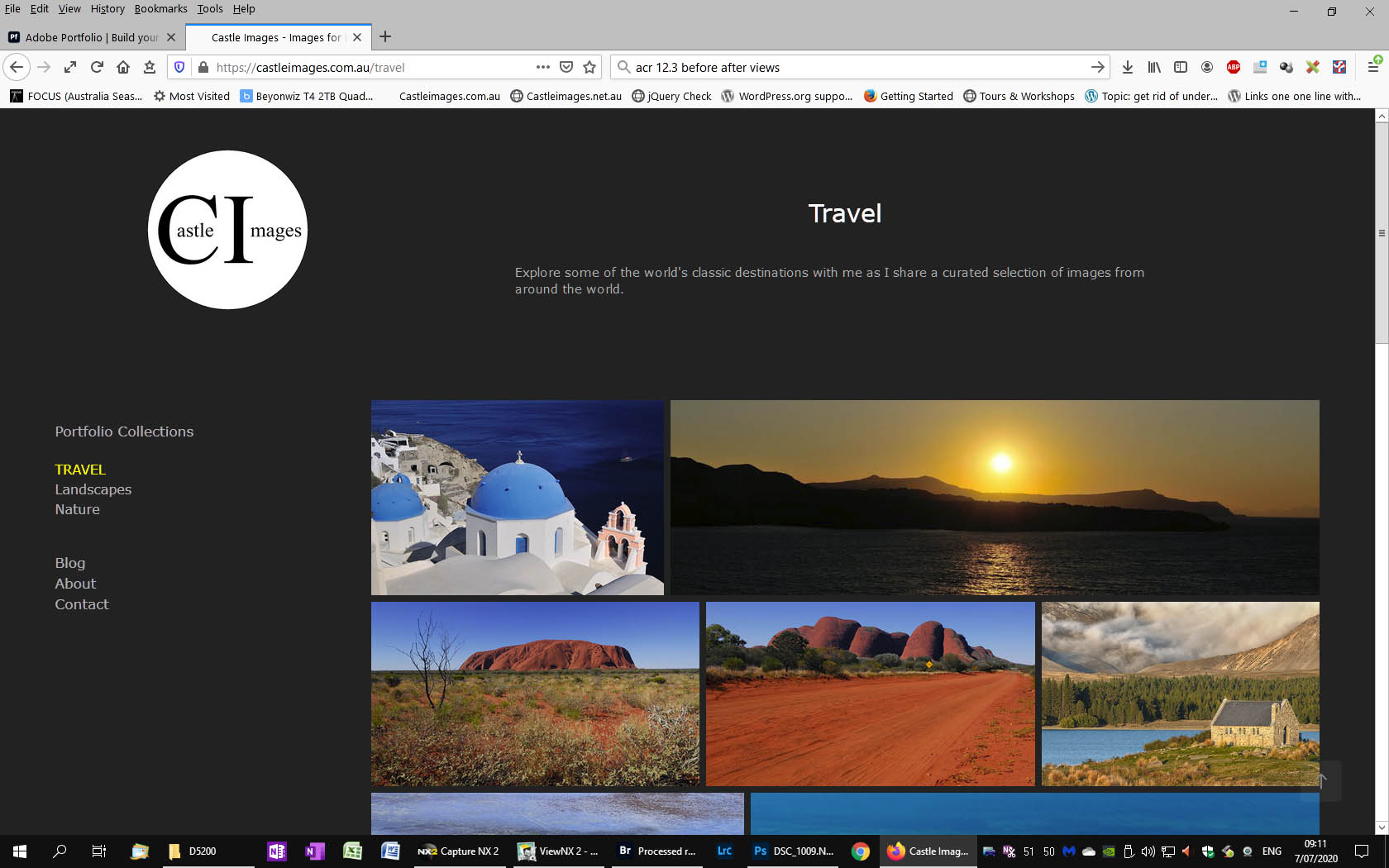
I am developing a WYSIWYG site through Adobe Portfolio. When viewed in the editor, image elements are in the correct position.
However, when viewed in FF, they are a long way out of position. In Chrome and Edge, they are much better, but still out by a small amount.
Please see attached screen dumps.
Any ideas? I suspect it is a combination of coding generated by the editor and the way FF interprets the code.
Regards,
Steve
Wubrane rozrisanje
Assuming you are referring to the fact that the menu on the left does not align to the top of the images, it's a scaling issue because of the logo.
In the editor, the width of the page is shrunk a bit. You can recreate this by dragging the sides of your browser window to make it narrower when you are viewing the website outside of editor. This happens because your logo grows and shrinks based on the width of the browser window.
The menu has X amount of space between the logo and the start of the menu. When the logo gets smaller, there's the same spacing between the logo and the menu, but the logo is smaller, so there's less space between the top of the page and the top of the menu.
It's the same concept for the images. There's X amount of space between the top of the images and the text above. However, the text size stays fixed, regardless of the width of the window, so the space between the top of the images and the top of the page stays the same.
This happens on every browser that I tried it on (Firefox, Chrome and Edge).
To be honest, I'm not really familiar with the editor that you are using, so I can't really give you specific steps on how to fix it, but I can explain the concept.
Probably the easiest way to fix it is to have the logo stay a constant size until the window is so narrow that it changes into mobile mode. Alternatively, you could put the logo and the text into the same container so that the spacing from the top of the images and the top of the menu will be set to the bottom of the same item.
Naturally, I'm not sure what you will be able to accomplish on your editor. Sometimes these types of editors are pretty frustrating when it comes to small tweaks like this and sometimes they convert the page into code in strange ways.
Hope this helps and hope you are able to get your website looking like you want it.
Tutu wotmołwu w konteksće čitać 👍 0Wšě wotmołwy (2)
Wubrane rozrisanje
Assuming you are referring to the fact that the menu on the left does not align to the top of the images, it's a scaling issue because of the logo.
In the editor, the width of the page is shrunk a bit. You can recreate this by dragging the sides of your browser window to make it narrower when you are viewing the website outside of editor. This happens because your logo grows and shrinks based on the width of the browser window.
The menu has X amount of space between the logo and the start of the menu. When the logo gets smaller, there's the same spacing between the logo and the menu, but the logo is smaller, so there's less space between the top of the page and the top of the menu.
It's the same concept for the images. There's X amount of space between the top of the images and the text above. However, the text size stays fixed, regardless of the width of the window, so the space between the top of the images and the top of the page stays the same.
This happens on every browser that I tried it on (Firefox, Chrome and Edge).
To be honest, I'm not really familiar with the editor that you are using, so I can't really give you specific steps on how to fix it, but I can explain the concept.
Probably the easiest way to fix it is to have the logo stay a constant size until the window is so narrow that it changes into mobile mode. Alternatively, you could put the logo and the text into the same container so that the spacing from the top of the images and the top of the menu will be set to the bottom of the same item.
Naturally, I'm not sure what you will be able to accomplish on your editor. Sometimes these types of editors are pretty frustrating when it comes to small tweaks like this and sometimes they convert the page into code in strange ways.
Hope this helps and hope you are able to get your website looking like you want it.
Thanks for the explanation. not a show stopper, but I like to be precise.
Regards,
Steve