Change Font Size in Library
Hi All,
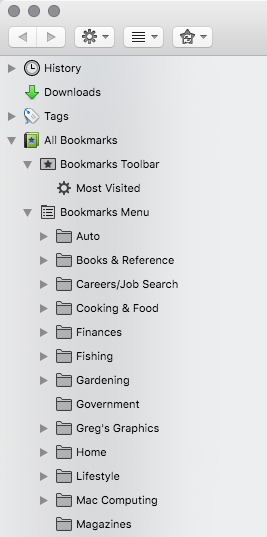
Not a big deal, just something I've been wondering about. When I have the Library window/panel open, I can see the list of bookmarks, tags, history, etc. Is there a way to change the font size of, say, the bookmarks list? In other words, the list of bookmarks shows folders and the names of those folders next to them. If I could change the font size of that text, I would hope that I could see more of the list. Hope that made sense. Thanks in advance.
Kiválasztott megoldás
Try the !important flag for all properties. Note that it might not be possible to go below a specific height. Does the 18px Jeff posted above work? You can also try to use a negative margin-bottom (or margin-top) to squeeze the items.
#placesList treechildren::-moz-tree-cell-text {
  font-size: 11px !important;
}

#placesList treechildren::-moz-tree-row {
  max-height: 18px !important;
  padding-bottom: 0px !important;
  margin-bottom: -3px !important
}
Válasz olvasása eredeti szövegkörnyezetben
👍 0
Összes válasz (10)
In what way if the font size a problem?
Is this horizontally or vertically or both?
Note that you can set what columns to show via "Views -> Columns" and drag items on the column header to adjust the column width. If there are (too) long names in the list then consider to shorten these long names to make more fit.
I need to be more specific. I'm actually referring to the sidebar on the left, rather than the 'main area' which is displayed when a folder on the left sidebar is selected. The size isn't a problem, I'd just think it would be great if it was a little smaller.
You should be able to make the left sidebar smaller since I'm not seeing folder names that are excessively long in the screenshot.
Otherwise you can use code in userChrome.css to adjust the font-size of the left pane in the Library.
Add code to the userChrome.css file below the default @namespace line.
@namespace url("http://www.mozilla.org/keymaster/gatekeeper/there.is.only.xul"); /* only needed once */

#placesList treechildren { font-size: 12px !important; }
- create the chrome folder (lowercase) in the <xxxxxxxx>.default profile folder if this folder doesn't exist
- use a plain text editor (Windows: Notepad; Mac: Textedit) to create a (new) userChrome.css file in the chrome folder (file name is case sensitive)
- paste the code in the userChrome.css file in the editor window
- make sure that the userChrome.css file starts with the default @namespace line
- save the file via "Save file as" in the text editor as userChrome.css
You can use the button on the "Help -> Troubleshooting Information" (about:support) page to go to the current Firefox profile folder or use the about:profiles page.
- Help -> Troubleshooting Information -> Profile Directory:
Windows: Show Folder; Linux: Open Directory; Mac: Show in Finder - http://kb.mozillazine.org/Profile_folder_-_Firefox
Thanks cor-el for the reply. I created the "chrome" folder and "userChrome.css" files, and added the code above. Nothing seemed to change. I used a small font size so it would be noticeable. I attached a screen grab of the open .css file. It also shows the directory file path (I'm on a Mac). What do we try next?
https://www.howtogeek.com/334716/how-to-customize-firefoxs-user-interface-with-userchrome.css/ https://www.accessfirefox.org/Theme-Font-Size-Changer.php https://www.userchrome.org/ https://www.accessfirefox.org/Firefox_Accessibility_Themes.php https://www.userchrome.org/what-is-userchrome-css.html http://techdows.com/2017/09/classic-theme-restorer-userchrome-css-modify-firefox-57-photon-ui.html http://kb.mozillazine.org/UserChrome.css https://github.com/axydavid/FirefoxUI/blob/master/README.md https://github.com/wilfredwee/photon-australis Note not all code in one place, dedicated sub-Reddit/Firefox on this Please let us know if this solved your issue or if need further assistance.
Can you make this column smaller by dragging its right border?
The code I posted works for me on Linux and I would assume that this works on Mac as well.
Does other code work if you place this in the file?
/* FONT-SIZE: urlbar searchbar findbar */
#urlbar *,#FindToolbar *,#search-container *{font-size:14pt !important;}
I think the rules for Mac are here:
https://dxr.mozilla.org/mozilla-release/source/browser/themes/osx/places/organizer.css
To override the rule starting at Line 14 that specifies 12px fonts:
#placesList treechildren::-moz-tree-cell-text {
  font-size: 10px !important;
}
But perhaps the bigger issue is the vertical spacing between the items? To address that, you could try:
#placesList treechildren::-moz-tree-row {
  max-height: 18px !important;
}
I'm going to try to attach screenshots (from a different computer...).
Módosította: jscher2000 - Support Volunteer,
@ jscher2000 - We're getting close. The code you posted worked for the font size... thanks! You're right on the money about the spaces between the items. For some reason, the code you posted didn't work for me. This is what I'm trying so far:
#placesList treechildren::-moz-tree-cell-text {
  font-size: 11px !important;
}

#placesList treechildren::-moz-tree-row {
  max-height: 12px !important;
  padding-bottom: 0px;
}
Módosította: cor-el,
Kiválasztott megoldás
Try the !important flag for all properties. Note that it might not be possible to go below a specific height. Does the 18px Jeff posted above work? You can also try to use a negative margin-bottom (or margin-top) to squeeze the items.
#placesList treechildren::-moz-tree-cell-text {
  font-size: 11px !important;
}

#placesList treechildren::-moz-tree-row {
  max-height: 18px !important;
  padding-bottom: 0px !important;
  margin-bottom: -3px !important
}
Thanks all for your help. The above code seems to get it close enough to where I'd like it (I have the font size at 7px, the max height at 13 and the bottom margin at -5). I was getting ready to try negative numbers. I'd eventually like to try to get the folder icons a little smaller, but it's not a priority. Thanks again.


