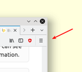
How can I make the "three lines menu" dropdown as opposed to slide?
Hi,
I would like to have the old style menu behavior back.
When I hover the mouse over the three horizontal lines, I would like the menu to automatically open, ideally without having to click on the three lines. When I hover the mouse over one of the menu items, I would like it to automatically drop down the connected submenu. At the same time, I would still like to be able to see the main menu.
How can I revert to the standard, old style menu?
선택된 해결법
jeffcompton said
the old menu takes up an additional line in the browser header, whereas the three lines menu doesn't.
You don't have to bring up the menu bar permanently ..... You can press the "Alt" key - that will bring up the menu bar, which will disappear again after you've clicked on whichever item you need.
문맥에 따라 이 답변을 읽어주세요 👍 1모든 댓글 (9)
Hi, what did you do to get that menu. Never heard of it before.
Please : Refresh but Note that this does more than uninstalling and re-installing does. Normal uninstalling does not remove some preferences which may have become corrupt. Please Refresh but do this 1st:
Pkshadow said
Hi, what did you do to get that menu. Never heard of it before. Please : Refresh but Note that this does more than uninstalling and re-installing does.
I am talking about the main menu on the upper right screen corner (see screenshot).
To open it, I have to click on it. Instead, I would like it to open automatically as soon as I move the mouse over it.
Inside, to open an item (e.g. "Help"), I have to click on it. Instead, I would like it to open automatically as soon as I move the mouse over "Help". I want a "dropdown" menu opening all by itself.
When I have opened a main menu item by clicking on it, the menu "slides" and shows its contents. The main menu then vanishes in favor of the menu item contents, and I have to click to get back. I do not want this. Instead, I want the menu to react the way menus have been reacting like for the last 30 years (!).
Since I am running a completely fresh install of linux OS, I do not want to "Refresh" anything. Surely there must be a dead simple way to switch menu behavior, from "slide menu" to "dropdown menu"?
Where is the checkbox "Give me the boring but less painful old style menus"?
That is how this type of doorhanger works. This isn't a menu, but merely a special container with fixed dimensions that can contain specific data. When you click a item that opens a sub section then the parent section closes to make room for the new list.
Ok, great. So let's call it doorhanger instead, even if the rest of the world tends to call it "menu".
But what if I don't like the way this doorhanger works, and I want the old doorhanger back?
Just as an example: In KDE, a right click on the menu gives you "alternatives", and you can switch back and forth between slide style, dropdown style and another, third option. Also in KDE it's a container - in which a menu is contained. But, it's customizable!
Is it really possible that the makers of firefox have decided to force people into doing tons of unnecessary mouse clicks, not allowing them to see all information at once and at the same time? That would be a big pity, and for me it would be a good reason to use another browser instead.
Or is there somewhere this checkbox, "I don't want this damn Apple style menu made for people who don't use their browser much, please give me the old and efficient menu instead"?
The old menu is there and has always been there.
Mouse to the top of the Browser and Right Click in a blank spot turn on Menu Bar or go to Customize then mouse to the Bottom Left to Tool Bars and turn it or them on as the Bookmark Toolbar is there also.
- https://support.mozilla.org/en-US/kb/what-happened-to-the-file-edit-and-view-menus
- https://support.mozilla.org/en-US/kb/bookmarks-toolbar-display-favorite-websites
Please let us know if this solved your issue or if need further assistance.
I'm still hoping that there's a hidden way to get the "three lines menu" to act as a dropdown menu too, since the old menu takes up an additional line in the browser header, whereas the three lines menu doesn't. So having the three lines menu as dropdown would be the ideal thing.
However, I really appreciate your support, and it's good to know that the old menu is still available. Many thanks for your help!
선택된 해결법
jeffcompton said
the old menu takes up an additional line in the browser header, whereas the three lines menu doesn't.
You don't have to bring up the menu bar permanently ..... You can press the "Alt" key - that will bring up the menu bar, which will disappear again after you've clicked on whichever item you need.
Thank you, McCoy

