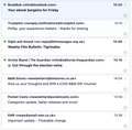
Can I make messages pane look like Betterbird?
I us an M2 Mac. I like Thunderbird, but prefer the Betterbird card view. Is there any way I can replicate this in Thunderbird?
I have attached two screenshots - one Betterbird, the other Thunderbird. I much prefer the Betterbird look, without the card frames and with the blue message header.
You might well say 'use Betterbird then!'. The problem is that Betterbird is not available in a native Apple Silicon version, only Intel, and therefore runs in emulation mode. Thunderbird has a native Apple Silicon version.
Just two small changes. Remove the card frame and make the unread message header blue. Surely that's possible somehow in Thunderbird?
All Replies (4)
I was using the latest Thunderbird beta. I tried downloading v 115.11.1 (Mac) and it looked the same. I started it up with a new profile and I got a different look in the messages pane. Exactly what I wanted. Where did my card view with outlines come from I wonder. Was it part of an older beta which was in my profile?
The Cards View message list can be customized with css, such as in this topic:
Thank you. That works. Now do you know how to remove the line after each message in the messages pane?
The code to add a line separator in the message list, for Table View and Cards View, is:
 table[is="tree-view-table"] td {
     border-bottom: solid 2px blue !important;
}
However, to hide the separator in Cards View, I haven't been able to identify the correct code, despite trying different things with the .thread-card-container element.


