Is it possible to change the font, size, and/or position for Add-on button text overlay labels?
I might be using terminology incorrectly here ("Add-on button text overlay labels"), but hopefully I can explain it clearly with screenshots.
Add-on buttons in Firefox can have an "overlay," usually a number indicating something. The most common example would be the dark grey label with a white number that appears over uBlock Origin's Add-on button that indicates how many items it blocked on the current page.
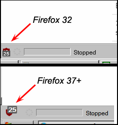
In Firefox 32, this overlay was a smaller number appearing in the bottom center part of the add-on button. Some version after 32 (I'm sure it's present in Firefox 37 onward; not sure about versions 33-36), this overlay label became larger and changed its position to the upper right part of the add-on button. Please see my attached picture showing screen capture comparisons of what I'm talking about.
The Mozilla add-on "Theme Font & Size Changer" began to affect this overlay label when it changed positions. "Theme Font & Size Changer" is a global setting, so if you like to set this to 12 point fonts, it will set the overlay label text to 12 points as well, which is bigger than the default. The "Theme Font & Size Changer" Add-on did NOT affect the add-on button overlay label text in Firefox version 32.
The attached picture showing the add-on button overlay label comparison has "Theme Font & Size Changer" set to 12 point fonts for both Firefox versions shown.
So my question is, is there a way to get the add-on button overlay text to appear as it did in Firefox 32? Maybe by way of userchrome.css?
Solução escolhida
Success! Thanks to your post, I was able to manipulate the badge using the info you provided. I do remember now that these overlays are called badges, but until I heard you say it, all I could think to call it was an "add-on button text overlay label". :P
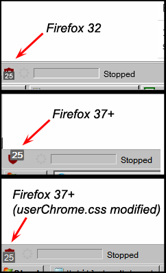
It's not a complete success... Theme Font & Size Changer hard locks the badge font size to whatever you enter for "Size" -> "Custom". But I was able to turn bolding off and move it more or less into its previous position. It seems that in Firefox 32, the badge itself was aligned to the left (text would fill in to the right), while in 37+, the badge is aligned to the right (text fills in to the left). I couldn't find a way to change this. (Tried "float: left" and "box-align: start", neither had any effect.)
So here's what I have in userChrome.css to achive the result in the attached screenshot:
@namespace url("http://www.mozilla.org/keymaster/gatekeeper/there.is.only.xul"); /* only needed once */

.toolbarbutton-badge {
  font-weight: normal !important;
  padding: -1px 1px 1px 1px !important;
  border-radius: 1px !important;
  margin: 5px 0 0 !important;
  margin-inline-end: 0 !important;
  text-align: center !important;
}
Thanks again! :D
Todas as respostas (7)
Hi, since no-one else has responded; I don't think that userChrome can be used to modify add-ons since they are made by individual developers and aren't part of the default Firefox UI. As far as uBlock Origin is concerned, you can remove those numbers in its Dashboard > Settings, but I suspect that isn't what you want to do.
If your question is resolved by this or another answer, please take a minute to let us know. Thank you!
The way the Add-on button overlay labels look appear to be independent of the add-on itself... that's the exact same version of uBlock origin in the screenshot in each Firefox version.
It does appear that at least the text size and position of these add-on button overlays are controlled by the browser UI, which is why I think it might be possible to change them by userchrome.css. But userchrome.css has a huge library of options, and no complete form of documentation seems to exist for it, probably due to the fact that these options are constantly changing and being updated with each new nightly build of Firefox.
I was hoping someone might know of userchrome.css options that are specific to these add-on button overlay labels.
That looks like a badge.
See .toolbarbutton-badge
- chrome://global/skin/toolbarbutton.css
- https://dxr.mozilla.org/mozilla-release/source/toolkit/themes/windows/global/toolbarbutton.css#125
Try this selector (not tested):
toolbarbutton[id^="ublock"] .toolbarbutton-badge {}
That looks very promising, however, I tried changing font weight to normal and text align to left for testing, and it had no effect.
I added the following to userchrome.css:
toolbarbutton[id^="ublock"] .toolbarbutton-badge {
  background-color: #d90000;
  font-size: 10px;
  font-weight: normal;
  padding: 0 2px 1px;
  color: #fff;
  border-radius: 2px;
  box-shadow: 0 1px 0 hsla(0, 100%, 100%, .2) inset,
              0 -1px 0 hsla(0, 0%, 0%, .1) inset,
              0 1px 0 hsla(206, 50%, 10%, .2);
  margin: -6px 0 0 !important;
  margin-inline-end: -8px !important;
  min-width: 14px;
  max-width: 28px;
  line-height: 10px;
  text-align: left;
  -moz-stack-sizing: ignore;
}
Did I do that correctly?
You always need to add the !important flag to override an existing CSS property value in case you didn't do this.
Solução escolhida
Success! Thanks to your post, I was able to manipulate the badge using the info you provided. I do remember now that these overlays are called badges, but until I heard you say it, all I could think to call it was an "add-on button text overlay label". :P
It's not a complete success... Theme Font & Size Changer hard locks the badge font size to whatever you enter for "Size" -> "Custom". But I was able to turn bolding off and move it more or less into its previous position. It seems that in Firefox 32, the badge itself was aligned to the left (text would fill in to the right), while in 37+, the badge is aligned to the right (text fills in to the left). I couldn't find a way to change this. (Tried "float: left" and "box-align: start", neither had any effect.)
So here's what I have in userChrome.css to achive the result in the attached screenshot:
@namespace url("http://www.mozilla.org/keymaster/gatekeeper/there.is.only.xul"); /* only needed once */

.toolbarbutton-badge {
  font-weight: normal !important;
  padding: -1px 1px 1px 1px !important;
  border-radius: 1px !important;
  margin: 5px 0 0 !important;
  margin-inline-end: 0 !important;
  text-align: center !important;
}
Thanks again! :D
Alterado por BlohoJo em
Thanks for reporting back on your findings.
Note that negative values for padding aren't valid. You can only use a negative value for the margin.


