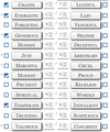
Can I hide the up/down arrows on input forms?
I'm having some display problems with the little up/down arrows that appear on numerical input forms. Most of the time these are pretty unobtrusive, but on some sites the arrows take up so much space they obscure the numbers in the field. I've added a screenshot from a Roll20 character sheet to illustrate the problem- the collumns are fixed-width, so re-sizing the window doesn't help, and I couldn't find any options in the settings menu which relate to these arrows.
Is there a way I can have the arrows hidden by default, and only appear when I mouse over the field? Or am I just going to have to use Goggle Chrome whenever I want to use this website?
Todas as respostas (3)
Check your zoom controls.
<Control> (Mac=<Command>) + (plus) enlarge - (minus) reduce 0 (zero) restore
This doesn't change the relative size of the arrows- the whole table gets bigger or smaller, but the arrows still take the same amount of space within each field.
You can add code to the userContent.css file to only show the spinners on hover.
input[type=number]:not(:hover) {-moz-appearance: textfield !important;}
- https://www.userchrome.org/what-is-userchrome-css.html
- https://www.userchrome.org/how-create-userchrome-css.html
In Firefox 69 and later you need to set this pref to true on the about:config page to enable userChrome.css and userContent.css in the chrome folder.
- toolkit.legacyUserProfileCustomizations.stylesheets = true

