How to allow Thunderbird to render columns outside the viewbox?
As originally asked at [Mozilla's Discourse instance](https://discourse.mozilla.org/t/how-to-allow-thunderbird-to-render-columns-outside-the-viewbox/135399?u=rokejulianlockhart):
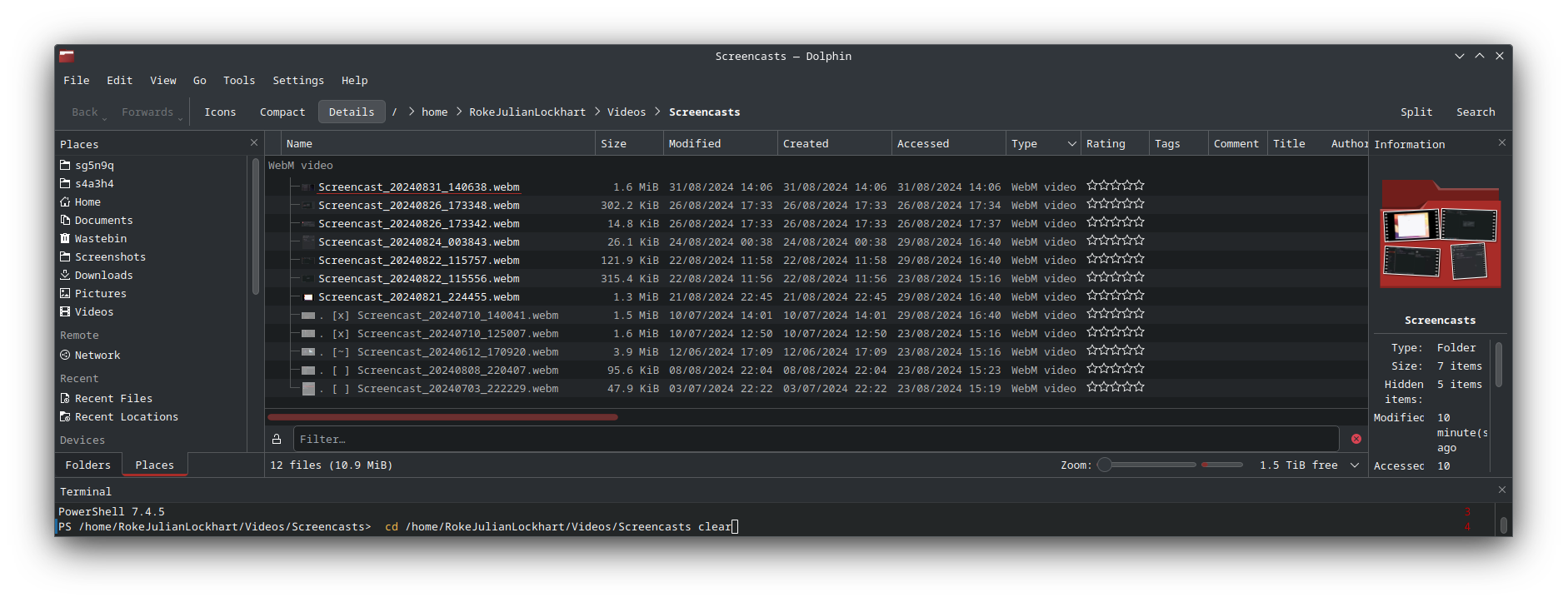
> When unmaximised, it’s certainly capable of this: > > >  > > However, when maximised, it loses this ability: > > >  > > …but it doesn’t matter much anyway, because the subject column is so compressed and impossible to uncompress: > > > > > Consequently, how do I permit the columns to render outside the viewport, like I can in KDE’s Dolphin file manager (as an example): > > > 
Chosen solution
Yes, when the option in the settings gets enabled, then the columns will have a fixed width that you can resize and they will maintained it and the whole area will scroll horizontally if needed. Exactly like an OS file manager.
Read this answer in context 👍 1All Replies (6)
Yes, I've just tested this and understand the situation you describe. I can replicate the problem.
But forcing the Message List to remain the same is currently not available.
The issue is made worse because you have a lot of the 'column headers' enabled, so they appear rather squished up and there is no room to expand any of them. When maximised you will discover you have to drag the vertical splitter to the left (the one which separates the Message List from the Message Pane). Eventually, the horizontal scrollbar appears, but now it's really squished. Mixed result here - useless Message List but plenty of space for Message PAne.
Dependsupon what you want to achieve - personally, I would want to make it easier to read the Message List. AS shrinking the Message List width by dragging the splitter is not exactly producing a result which is useable, I found other workarounds were a better option.
Current methods to get a more instant result. Reduce the number of column headers you have selected. eg: You have 'From, Recipient and Correspondents. You will discover Correspondents shows same as From, so may as well remove Correspondents. You have the 'Status' column which displays New or Unread. New always has a yellow star against Subject. Unread always has a green dot in the 'Sort by read status' column header. Read always has greyed out/no green dot. So do you need the 'Status' visible as well?
When maximised: Change the View > Layout > to Classic Then Message Pane is below thus allowing a lot more space for the column headers which means they can read more easily.
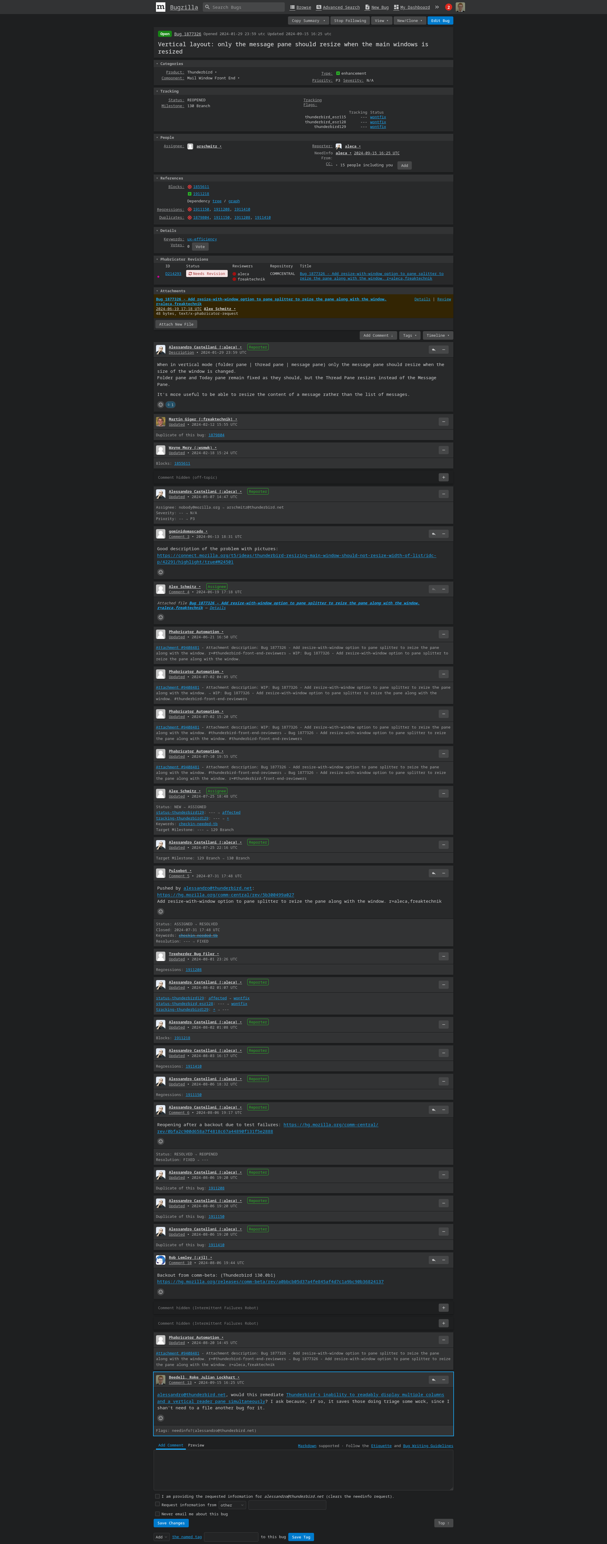
I do recall someone posted a bug - it was asking if window made wider or maximised then increase the area allowed for the Message Pane not the Message List if using View > Layout > Vertical. OK I found it:
- Vertical layout: only the message pane should resize when the main windows is resized
- https://bugzilla.mozilla.org/show_bug.cgi?id=1877326
Looks like they are trying to come up with a solution but not succeeded at this point. I've tested in beta 131.0b3 and there is a small increase in the width of Message Pane, the width of the window means the Message List has seen most of increase. So not fixed as yet.
Thank you, @Toad-Hall. That was comprehensive. I've requested confirmation of the scope of that bug at https://bugzilla.mozilla.org/show_bug.cgi?id=1877326#c13, because it seems indeed to be what I was looking for - saves me filing a report.
By the way, I've also filed https://bugzilla.mozilla.org/show_bug.cgi?id=1918924#c0 about the lack of markup syntax support here. It's dreadful.
Hi, we're gonna experiment with this feature in https://bugzilla.mozilla.org/show_bug.cgi?id=381821 We're not sure if it's something we can easily support without issues but we will release some try builds for users to test. Cheers
Hi, I'm pleased to let you know that a patch has been approved to enable the option to have horizontal scrolling in the message list. This feature will be soon available in Daily and in Beta 132. Cheers,
@castellani.ale, can you confirm that that necessarily entails that the column width is fit to its content, like in the aforementioned Dolphin FM, or Windows's Explorer FM? Irrespective, I am thankful for the update.
Chosen Solution
Yes, when the option in the settings gets enabled, then the columns will have a fixed width that you can resize and they will maintained it and the whole area will scroll horizontally if needed. Exactly like an OS file manager.


