Font size not consistent in Read, Reply and Write windows
I've just installed TB 115.6 on my MacBook to see if I like it better than Apple Mail. There is one thing that seems weird to me. Fonts are displayed larger in the Read window than in the Write and Reply windows.
These are my font settings: Default font: Helvetica, size 14 Composition, HTML Style: font: variable width, size: medium
Now if I send an e-mail to myself the font looks larger once I receive the message than what it looked like when I was composing it. And then if I reply to this message the font becomes smaller again in the Reply window.
The font in the Write window has the exact same appearance as in Apple Mail where I also defined Helvetica 14 as the default font. So my suspicion is that the fonts are somehow scaled up in the Read window. But why? And how to change it so that the same font looks the same everywhere?
Vybrané riešenie
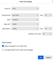
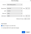
Okay, this may sound strange, but here is the real way to set fonts on Thunderbird. And I attached examples of my own setting of Calibri 14 as my default. Here goes:
- in Tools>settings>general, set your default font.
- then click the advanced button. Notice the drop-down menu at top. It probably says 'latin' or 'other writing systems' - this is IMPORTANT:
- select 'latin from that menu, set your desired font and font size settings, click OK,
- select 'otherwritingsystems' from the drop-down menu and set the IDENTICAL settings to what you did for Latin, and then click OK. In attached screenshots you will see my latin and otherwritingsystem match.  Notice I also set monospace font.
- and, if you have account set to compose HTML, then set that in tools>settings>composition to variable-width and medium font. (You would only change the HTML font setting if your intent is for recipient to receive your preferred font - not my personal recommendation.)
- Set Sending Format to 'automatic'
With these settings, your compose window and your sent folders will match. And if you don't write HTML (e.g., bold, italic, color), none will be sent . If you do these settings once, your font will always be consistent. This does not protect you from someone sending you a message in some god-awful font with 30 pt size, but this does provide consistency.
Čítať túto odpoveď v kontexte 👍 2Všetky odpovede (3)
Vybrané riešenie
Okay, this may sound strange, but here is the real way to set fonts on Thunderbird. And I attached examples of my own setting of Calibri 14 as my default. Here goes:
- in Tools>settings>general, set your default font.
- then click the advanced button. Notice the drop-down menu at top. It probably says 'latin' or 'other writing systems' - this is IMPORTANT:
- select 'latin from that menu, set your desired font and font size settings, click OK,
- select 'otherwritingsystems' from the drop-down menu and set the IDENTICAL settings to what you did for Latin, and then click OK. In attached screenshots you will see my latin and otherwritingsystem match.  Notice I also set monospace font.
- and, if you have account set to compose HTML, then set that in tools>settings>composition to variable-width and medium font. (You would only change the HTML font setting if your intent is for recipient to receive your preferred font - not my personal recommendation.)
- Set Sending Format to 'automatic'
With these settings, your compose window and your sent folders will match. And if you don't write HTML (e.g., bold, italic, color), none will be sent . If you do these settings once, your font will always be consistent. This does not protect you from someone sending you a message in some god-awful font with 30 pt size, but this does provide consistency.
Thank you David, this is brilliant! I had everything set as you describe, apart from the settings in "Other Writing Systems". So the settings under "Other Writing Systems" determine how messages look in the Read window?
But seriously, why does Thunderbird make it so complicated to have the same font in every window? I mean it should go without saying that I want a message someone sent to me to look the same in the Read and in the Reply windows.
Okay, first, latin is the western setting and other writing systems is the unicode fonts. DO BOTH.
On your question, I encourage not to attempt to figure out the Mozilla strategy. In fairness, Thunderbird has almost infinite font capabilities, so it requires more settings. Thunderbird, in my opinion, is not a client to use 'out of the box' but needs some tweaking. But the tweaking makes it really good. :)


