Nav-Bar Left & Right Margin Adjust? (nav buttons are not all square)
Hi All,
Is there a way to make the Nav Bar flush with the left and right margins of the browser?
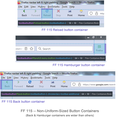
The way it is now, the margins are a bit too much inward, not reaching the ends of the browser window, which makes the buttons on the ends (Back and Hamburger) too wide, as can be seen by the wide highlight when hovering over them. This makes the end buttons rectangular instead of square.
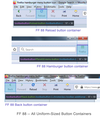
In FF 88, these buttons were flush with the left and right margins of the window, making all buttons on the Nav Bar square.
I'd like all the Nav Bar buttons to be perfectly square and symmetrical. This apparently requires adjusting the left & right margins of the Nav Bar... or is the Nav Bar just too short causing it to stretch itself to the ends of the window? I'm not sure.
Please see attached 2 images.
Thanks!
เปลี่ยนแปลงโดย Slouch เมื่อ
การตอบกลับทั้งหมด (2)
It appears this issue is more related to the size of the nav button containers.
Maybe this toolbox view will help (see attached images).
The buttons in FF88 are all in uniform-sized containers (57 x 50).
The buttons in FF115 are not in uniform-sized containers. Back & Hamburger buttons are in containers which are 64 x 50. The other nav buttons are in containers that are 58 x 50.
The purple area in the toolbox view apparently shows the button containers.
Is there a way to have uniform button containers in FF 115 & FF 125?
เปลี่ยนแปลงโดย Slouch เมื่อ
I'm also adding text to my nav buttons with the following code. Is this code affecting the size of the nav button containers?
toolbar .toolbarbutton-1[label]{
  flex-direction: column;
  align-items: center !important;
}
toolbar .toolbarbutton-1[label]:not([disabled]):hover{ background-color: var(--toolbarbutton-hover-background) !important; }
toolbar .toolbarbutton-1[label] > .toolbarbutton-icon,
toolbar .toolbarbutton-1[label] > .toolbarbutton-badge-stack{
  padding: var(--toolbarbutton-inner-padding) !important;
  padding-bottom: 0px !important;
  height: calc(var(--toolbarbutton-inner-padding) + 16px) !important;
  border: none !important;
  background-color: transparent !important;
  box-shadow: none !important;
}
toolbar .toolbarbutton-1[label] > .toolbarbutton-text {
  display: flex !important;
  min-height: 16px !important;
  padding-top: 3px !important;
  padding-bottom: 6px !important;
  background-color: transparent !important;
  overflow: hidden;
  width: 9ch; /* changes space between buttons */
}
toolbar .toolbarbutton-1[label] > .toolbarbutton-text::before{
  margin-inline: auto;
}
:root:not([uidensity="compact"]) toolbar .toolbarbutton-1[label] > .toolbarbutton-text{ padding: 2px !important; }
เปลี่ยนแปลงโดย Slouch เมื่อ


