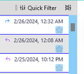
The reply and forward icons are to small
I'm trying to increase the size of icons for the reply and forward icons next to the subject. I go to settings and increase the font and the font does increase, but the icons stay the same size. Can I bold them or highlight them somehow? Thank you.
Ọ̀nà àbáyọ tí a yàn
Use this css to change the size of the replied and forwarded icons:
/* replied forwarded icon size */
tr[data-properties~="replied"] :is(.subject-line img, .replied),
tr[data-properties~="forwarded"] :is(.subject-line img, .forwarded) {
  width: 24px !important;
  height: 24px !important;
}
Help/Troubleshooting Info, Profile Folder, Open Folder, close TB, create a new folder named chrome, create a new document in chrome with a text editor, name it userChrome.css, Save as type: All files *.*, copy in the above code, change the number as desired. Double-click toolkit.legacyUserProfileCustomizations.stylesheets to true in Settings/General/Config. editor, restart TB.
video on how to create a css file (Firefox and TB)
See attached pictures, which show the effect in Cards View. In Table View, the icon size and density (compact, default, relaxed) should be adjusted to avoid distortion.
To change the size of the attachment icon:
/* attachment icon size */
:is(.attachmentcol-column img, .attachment-icon) {
  width: 18px !important;
  height: 18px !important;
}
Ka ìdáhùn ni ìṣètò kíkà
👍 0
All Replies (5)
I am not aware of reply and forward icons in the message list pane, nor do I see them in the screenshot. Would you be able to send bigger screenshots and highlight the icons? Are you using an addon for this? Thank you.
Please see attached screenshot. I am not using any add-ons.
Now I see; you are referring to the 'replied to' and 'forwarded to' icons. This link may help. That is, it increases the size of the message list content, and that may also increase size of those icons. https://support.mozilla.org/en-US/questions/1428118#answer-1612208
Ọ̀nà àbáyọ Tí a Yàn
Use this css to change the size of the replied and forwarded icons:
/* replied forwarded icon size */
tr[data-properties~="replied"] :is(.subject-line img, .replied),
tr[data-properties~="forwarded"] :is(.subject-line img, .forwarded) {
  width: 24px !important;
  height: 24px !important;
}
Help/Troubleshooting Info, Profile Folder, Open Folder, close TB, create a new folder named chrome, create a new document in chrome with a text editor, name it userChrome.css, Save as type: All files *.*, copy in the above code, change the number as desired. Double-click toolkit.legacyUserProfileCustomizations.stylesheets to true in Settings/General/Config. editor, restart TB.
video on how to create a css file (Firefox and TB)
See attached pictures, which show the effect in Cards View. In Table View, the icon size and density (compact, default, relaxed) should be adjusted to avoid distortion.
To change the size of the attachment icon:
/* attachment icon size */
:is(.attachmentcol-column img, .attachment-icon) {
  width: 18px !important;
  height: 18px !important;
}
Thanks David! You started me on the right track and I did what sfhowes described above. I also figured how to change the color! Thank you to you both!


