How do I force "toolbars" on web pages to scroll up and away when I scroll the page?
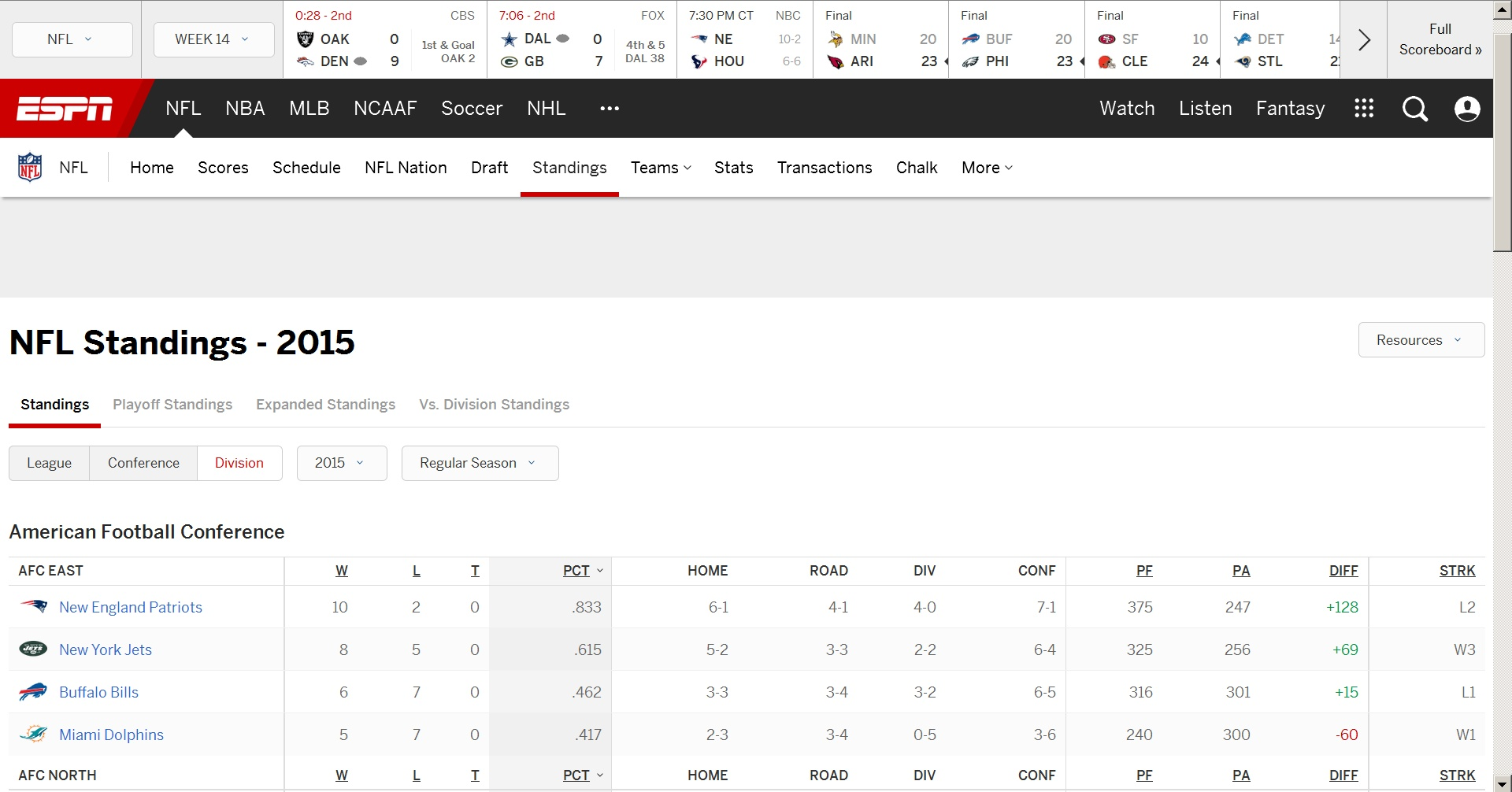
A lot of pages have one or more toolbars or widgets that remain locked in place at the top of the web page when you scroll up and down. How do I disable their ability to do that? It is so annoying when crap like that takes up 1/3 of your screen and thus leaves much less area available for what you are trying to read. The attached image is for a particularly annoying page that is typical of the way mentally handicapped web developers at ESPN waste your screen space: sports.espn.go.com/nfl/standings has *THREE* of those annoying widgets: one goes away when you scroll down enough but you are stuck with the other two no matter how far down you scroll.
Many web pages compound the problem by also putting locked-in-place content at the bottom of the page, further reducing the useable viewing area - crap like that should not be visible until you scroll down to the very bottom of the web page.
被采纳的解决方案
You could possibly use the Stylish extension to add some site specific rules to hide these elements, but that will hide them completely.
- Stylish: https://addons.mozilla.org/firefox/addon/stylish/
- http://userstyles.org/help/stylish_firefox
@-moz-document domain(sports.espn.go.com){
 #global-scoreboard { display:none!important; }
 #global-header { display:none!important; }
}
定位到答案原位置 👍 1
所有回复 (4)
That is from the way the page is programmed. Some have a closing X but many do not.
选择的解决方案
You could possibly use the Stylish extension to add some site specific rules to hide these elements, but that will hide them completely.
- Stylish: https://addons.mozilla.org/firefox/addon/stylish/
- http://userstyles.org/help/stylish_firefox
@-moz-document domain(sports.espn.go.com){
 #global-scoreboard { display:none!important; }
 #global-header { display:none!important; }
}
That Stylish suggestion works very well - many thanks. I already had Stylish installed and was in the process of trying to figure out how to make those elements scrollable - I never thought about just hiding those useless things completely. Even bald guys have blonde moments.
What really lit my fuse today was wanting to be able to fit the standings for an NFL conference onto a screen and not being able to even after zooming the page down to 80% ... at which point my old eyes couldn't read anything anymore.
You're welcome.
Note that you can right-click in item and open the Inspector (Inspect Element) to find the ID or other selector of an element.
In this case there is probably a lot of JavaScript present that complicate things, so hiding unwanted elements is probably easiest in this case.

