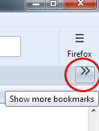
How to customize the "Show more bookmarks" and "New tab" buttons
Hi there,
In FF 58, which CSS selectors control the attributes of the following buttons...
"Show more bookmarks" button on the Personal Toolbar (chevron label). I would like to vertically center the chevron, and make the font size smaller.
"New Tab" button (plus sign). It is almost invisible on top of my gradient background on the TabsToolbar. I would like to change the color of the plus sign, and the border color.
Please see attached images.
Thank you!
由Slouch于
被采纳的解决方案
I don't have a lot of experience resizing the button images. Can you find the height/width in the Inspector and see whether it has any effect to change those?
定位到答案原位置 👍 0所有回复 (10)
Why is your chevron floating up like that? Maybe related to the positioning of icons vs. labels.
#PersonalToolbar #PlacesChevron
For the new tab button, there are two, the second one is used in "overflow" situations when the tab bar becomes scrollable:
#tabbrowser-tabs .tabs-newtab-button
#TabsToolbar #new-tab-button
And so you can discover these interesting things for yourself in the future, have you heard about the Browser Toolbox?
Yes, the chevron may be floating up because of some CSS mods provided by Aris to show Classic Toolbar Buttons (see attached image). I'm guessing the chevron is a graphic image and not a text label (since the house image is also floating up on the Home button). I would like to vertically center the chevron, and modify its size, independently of the other toolbar buttons.
( thank you for suggesting the Browser Toobox - that will be very handy in the future )
由Slouch于
This will make the button smaller, but does not align the image vertically...
  #PlacesChevron, #nav-bar-overflow-button {
    width: 22px !important;
    height: 22px !important;
    vertical-align: middle !important;
  }
The chevron image is defined as follows...
  #PlacesChevron, #nav-bar-overflow-button {
      list-style-image: url("chrome://browser/skin/chevron.svg")
  }
My CSS is deficient. Any help would be appreciated!
由Slouch于
If you inspect the rules being applied to the chevron, can you find the rule that needs to be overridden to restore the normal positioning?
I unchecked all the boxes in the Rules pane, but nothing seems to make a difference with the vertical alignment.
Hint please? :)
I have no idea. You have rules from classic that are modifying the toolbar buttons. I do not use those rules. You are in the best position to track it down.
OK, the following rules from classic are modifying toolbar buttons, and causing the chevron to float to the top...
toolbar:not(#TabsToolbar) toolbaritem .toolbarbutton-1 .toolbarbutton-text,
toolbar:not(#TabsToolbar) .toolbarbutton-1:not([type="menu-button"]) .toolbarbutton-text,
toolbar:not(#TabsToolbar) .toolbarbutton-1[type="menu-button"] toolbarbutton
.toolbarbutton-text{
  display: -moz-box !important;
  padding: 0 !important;
}

toolbar:not(#TabsToolbar) toolbaritem .toolbarbutton-1:not([type="menu-button"]),
toolbar:not(#TabsToolbar) .toolbarbutton-1:not([type="menu-button"]),
toolbar:not(#TabsToolbar) .toolbarbutton-1[type="menu-button"] toolbarbutton{
  -moz-box-orient: vertical !important;
}
Is there a way I can override these rules for #PlacesChevron ?
由Slouch于
If you only want to apply those rules to the main navigation toolbar, you could edit them as follows:
#nav-bar toolbaritem .toolbarbutton-1 .toolbarbutton-text,
#nav-bar .toolbarbutton-1:not([type="menu-button"]) .toolbarbutton-text,
#nav-bar .toolbarbutton-1[type="menu-button"] toolbarbutton .toolbarbutton-text {
  display: -moz-box !important;
  padding: 0 !important;
}

#nav-bar toolbaritem .toolbarbutton-1:not([type="menu-button"]),
#nav-bar .toolbarbutton-1:not([type="menu-button"]),
#nav-bar .toolbarbutton-1[type="menu-button"] toolbarbutton {
  -moz-box-orient: vertical !important;
}
Yes, that worked well. The chevron is now unaffected (see image).
Is there a way to adjust the size of the chevron's list-style-image, or the containing button? I would like it to be a bit smaller.
由Slouch于
选择的解决方案
I don't have a lot of experience resizing the button images. Can you find the height/width in the Inspector and see whether it has any effect to change those?


