Solved - toolbar buttons in address bar
Hi,
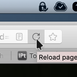
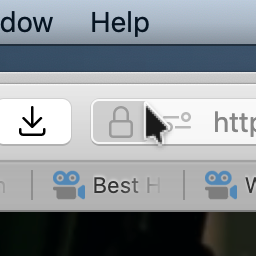
does anyone know what to do to make the background of the bookmarks icon and the reload icon the same as the icon with the site connection lock? I've exhausted all options in the userChrome.css and cant get the background to change. It's in hover state.
For reference I've added a couple of images, the first how the background is and the second how I would like it to look. I'm on macOS and latest Firefox 111.
Best regards,
Johnny
由jstewen于
被采纳的解决方案
Got the sucker, yay:-D.
All I needed was to put this pice in the urlbar elementproperties in my userChrome:
--urlbar-min-height: 23px !important;
The underlying factor was, per the Browser Toolbox, that the url bar height for the page-action-buttons was set to 32px where as my userChrome was set to 23px. So I just needed to paste the above code and change it from 32 to 23px.
Thanks for all your help:-).
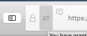
Below is a screenshot attached to original post to reflect the change.
定位到答案原位置 👍 0所有回复 (6)
I don't know about those specific icons but you can make the 'hover' background the same for all icons with this. Choose your own colour, of course.
:root { --button-hover-bgcolor: #6699ff !important; }
Note that if you use a theme, that this can affect the background of toolbar buttons and you may not be able to override it.
@Terry and @cor-el thank you for your answers. I'll try it out when I get home and I'll keep in mind that themes may alter the bavkground.
I'll report back, off course, and mark as solved.
由jstewen于
Ok, so I investigated further and found that the icons on the right, when hovering over them, scale with ithe url bar and the icons on the left doesn't. So, the question is what are the elements on the left called and how to get them to scale if possible. Any insight guys?
What code are you currently using in userChrome.css that might possibly affect this area ?
选择的解决方案
Got the sucker, yay:-D.
All I needed was to put this pice in the urlbar elementproperties in my userChrome:
--urlbar-min-height: 23px !important;
The underlying factor was, per the Browser Toolbox, that the url bar height for the page-action-buttons was set to 32px where as my userChrome was set to 23px. So I just needed to paste the above code and change it from 32 to 23px.
Thanks for all your help:-).
Below is a screenshot attached to original post to reflect the change.
由jstewen于


