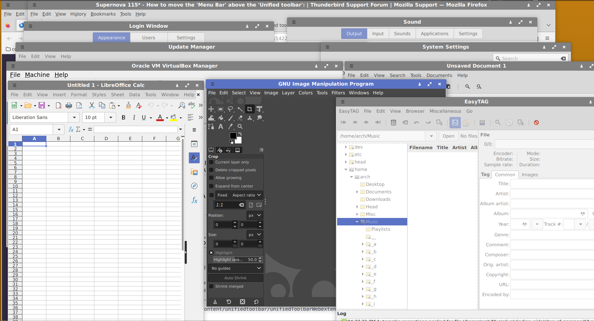
Please keep the option of a separate mail toolbar as this new design breaks consistency with most linux programs..
Can there please be an option to un-unify the dynamic toolbar? Attached are two screen shots. The first shows the top of a myriad of linux applications. The second attachment show the former version of thunderbird.
All share a common theme. At the top is what I think is called the system bar with the min/max/close icons at the right, the title in the center, and the hamburger icon for a menu of system options on the left. Below that is what I think is called the menu bar which in most cases contains submenus like "File", "Edit", etc. Further more there is a coomon design theme where in my theme selection, has the system and menu bars in different colors. For the active window, the system bar is in color and for the other it is darker than the menu bar.
A consistent style across most applications. To a great extent, the system bar is for top-level system options, not the application. Consistency is good. Consistency is efficient.
The latest version of thunderbird breaks that consistency, in a variety of ways. Some people might like the new look, but if you are going to break the consistency of design, at least give users the option of restore the consistent style. Have a option to leave the system bar as it was, have a separate "mail toolbar" under the menu toolbar as it used to be, and use the standard colorization of the various toolbars so the only one which is colored is the system toolbar.
Thank you.
被采纳的解决方案
所有回复 (3)
I have a partial solution. In the Thuderbird Settings under General, there is an option under Window Layout called "Hide system window title bar". Uncheck that and that gets rid of the unified aspect of the system bar.
The remaining lesser issue is the placement of what I call the "Mail Toolbar" (GetMessages, Write, Next ...). Unlike the previous version of TB, that Mail Bar is located above what I call the Menu Bar (File, Edit, View, ...) so it is between the System Bar and the Menu bar.
In the previous versions of TB, the Mail Bar was below the Menu Bar. That to me is the logical location for it (which is probably why it was placed there in the previous versions of TB). Please relocate that bar to where it was previously or at least explain the rationale for moving it.
Thanks Matt, let me expand. The title of the thread you sent me to was How to move the 'Menu Bar' above the 'Unified toolbar'. My original request was to give an option for allowing for the TB toolbar to remain separate from the System Title. As I indicated in my reply, I found out how I could do that, by unchecking "Hide system window titlebar". But that solution alone left the TB tool bar in the wrong location (above the menu bar). On a system with the tool bar un-unified, following the instructions in the How to move the 'Menu Bar' above the 'Unified toolbar' thread will move the tool bar so the three bars will be in the order System Title bar, Menu bar, and TB tool bar. So I can confirm that the solution in that thread works in the situation where there is no unified tool bar.
由azalea4va于


