為了改善您的使用體驗,本網站正在進行維護,部分功能暫時無法使用。若本站的文件無法解決您的問題,想要向社群發問的話,請到 Twitter 上的 @FirefoxSupport 或 Reddit 上的 /r/firefox 發問,我們的社群成員將很快會回覆您的疑問。

搜尋 Mozilla 技術支援網站

防止技術支援詐騙。我們絕對不會要求您撥打電話或發送簡訊,或是提供個人資訊。請用「回報濫用」功能回報可疑的行為。

了解更多

Get back old compact and convenient interface!

more options

Hello!

An upgrade as been made and the interface is getting once more worse and worse: simply LACK OF SPACE that LEAVE NO PLACE FOR EMAILS! Thunderbird version is 115.3.1

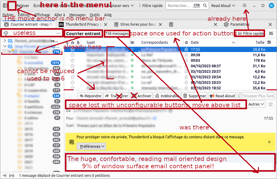
Here is a snapshot that shows: − a useless "status" bar without folder total/unread numbers, − menu bar and toolbar inverted, − a huge list of message that cannot be reduced below 8 lines; why the hell someone as added this limit that didn't exist before!? We could reduce to one line if we want or… punctually need it. − a TOTALLY useless message list header (name on folder panel, size in status bar, filter in upper toolbar − a NOT CONFIGURABLE message header, especially, impossible to choose the kind of button (text or icon, to get PLACE) in the action bar… that starts with a SPACE! Neither can we choose which buttons to move in the drop down list "plus". Actually, the message list header was used to display such actions. This would free space. − a useless empty space above the account panel; it would be much better to get back the receive All/this account button on top. − finally, the whole aim of a mail software is to… READ EMAIL… in a space as large as the private life warning banner! This is just nonsense, unacceptable. It started years ago for some of these designs, but now it is the worse I have ever seen; it makes thunderbird simply unusable. The settings panel doesn't help, with so few parameters.

The whole thing being designed for a 30" screen I would be please Thunderbird ships me and buy me, with the trolley to carry it with my laptop. As a Linux user, I am not working on full screen windows style, but reduced size to work on and access several windows at a glance. Working full screen is NOT an option. By the way, the 99% active surface of the windows makes it bloody hard to select below another one or simply… MOVE! Especially since there is no more title bar… (I just have found the ONE squared cm that allows it, with no menu bar…)

So, how can I set back old disposition or how can I set it in a pleasant and usable way? Especially these two points: − reduce the message list to less than 8 or 6, − set the message header buttons to icon OR text.

Sorry for the tone, I am really upset to see this evolution for a few years imposed to me, a user since the beginning, when it was in the Netscape suite. I am wondering what tiny laptop users think of it.

Thanks.

Hello! An upgrade as been made and the interface is getting once more worse and worse: simply LACK OF SPACE that LEAVE NO PLACE FOR EMAILS! Thunderbird version is 115.3.1 Here is a snapshot that shows: − a useless "status" bar '''without folder total/unread numbers''', − menu bar and toolbar inverted, − a huge list of message that '''cannot be reduced below 8 lines'''; why the hell someone as added this limit that didn't exist before!? We could reduce to one line if we want or… punctually need it. − a '''TOTALLY useless message list header''' (name on folder panel, size in status bar, filter in upper toolbar − a NOT CONFIGURABLE message header, especially, impossible to '''choose the kind of button''' (text or icon, to get PLACE) in the action bar… that starts with a SPACE! Neither can we choose which buttons to move in the drop down list "plus". Actually, the message list header was used to display such actions. This would free space. − a useless empty space above the account panel; it would be much better to get back the receive All/this account button on top. − finally, the whole aim of a mail software is to… READ EMAIL… in '''a space as large as the private life warning banner!''' This is just nonsense, unacceptable. It started years ago for some of these designs, but now it is the worse I have ever seen; it makes thunderbird simply unusable. The settings panel doesn't help, with so few parameters. The whole thing being designed for a 30" screen I would be please Thunderbird ships me and buy me, with the trolley to carry it with my laptop. As a Linux user, I am not working on full screen windows style, but reduced size to work on and access several windows at a glance. ''Working full screen is NOT an option.'' By the way, the 99% active surface of the windows makes it bloody hard to select below another one or simply… MOVE! Especially since there is no more title bar… (I just have found the '''ONE squared cm''' that allows it, with no menu bar…) So, how can I set back old disposition or how can I set it in a pleasant and usable way? Especially these two points: − '''reduce the message list''' to less than 8 or 6, − set the '''message header buttons''' to icon OR text. Sorry for the tone, I am really upset to see this evolution for a few years imposed to me, a user since the beginning, when it was in the Netscape suite. I am wondering what tiny laptop users think of it. Thanks.
附加的畫面擷圖

所有回覆 (1)

more options

Go into Config Editor and search for layout.css.devPixelsPerPx

mine was set to 1.65 and edited to 1.25 and now things are acceptable