

How do I get the Subject in the inbox list to show above the From like Outlook?
I'm trying to switch from Windows Live Mail 2012 to Thunderbird, but Thunderbird puts the "subject" and the "from" in different side-by-side columns so that it's less readable than Live Mail or Outlook which puts the subject above the from; any way to change this?
Example: http://imgur.com/6exa7ic
Modified by dhinged
Chosen solution
Apparently it isn't possible.
Read this answer in context 👍 0All Replies (8)
I'm not exactly sure what you are talking about.
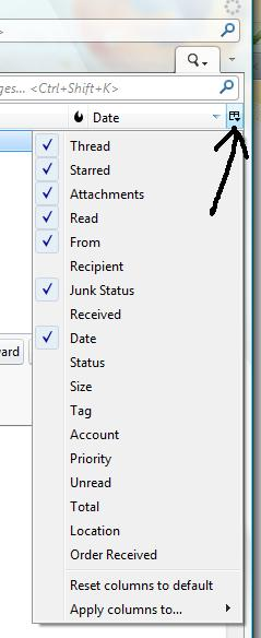
Column headers are at the top of the email list. You can choose which columns you wish to display...see first image. You can move them to the left or right, left click hold down to grab and drag sideways. Release mouse when in correct position.
so if you prefer 'FROM, Subject, Date you can move the columns into whatever order you prefer.
But then you say Live Mail which puts the subject below the from.. so that part is confusing because now you are not talking about columns at all. But if you are talking about the message headers then they are in that order already by default.
It may help if you can post images of what you see in WLM and what you see in TB.
Modified by Toad-Hall
I've just been searching on the internet to see what WLM offers in views. There seems to be a view option of using a vertical view which displays the list not as a list with columns but like a header which uses alot of space. I think this is what you are referring to.
I think I've seen something like this in Outlook, but I would not agree with the easier to read. I suppose it is what you get used to seeing.
This is just something you may have to get used to in Thunderbird. Lists are displayed as lists with columns. columns can be enabled/disabled, moved, sorted upon etc.
I would suggest you look at whether you need all the default columns and disable those you may not need to reduce what you might feel is 'clutter'. There is a lot of information and functionality available in Thunderbird header columns.
For example, I have a lot of emails from specific email addresses such as this forum. They are filtered into a specified folder, so in that folder I do not even need to see a 'FROM' or 'Correspondent' column because it will always be the same. I do not need to have the Junk Status showing either as none will ever be junk. This is just an example of how you can set up folders to display different columns depending upon needs.
You can also modify the look or increase the font etc to make easier to read. This is a good addon extension if making the general fonts larger than the default.
Chosen Solution
Apparently it isn't possible.
Modified by dhinged
I'm not sure what view you are using, but I use 'Classic view'. Menu icon > Options > Layout > Classic View
The view you mention in Outlook would be to have the folders listed on left, the email list in the middle and email content displayed to the right. In Thunderbird this would be the Vertical view. I would say this is not necessarilly the best as space could be an issue - depends upon your screen size. If you have a wide screen then it would be ok. Outlook get around a space - width for list - issue by producing the format you mention, which has other issues as it can only show a very limited number, so needing a load of scrolling just to see the list. My mother uses it and in the same space for 8 in a list, in Thunderbird I can see about 30 + emails.
So try using Classic view and selecting only the columns you require. I have a screen width in excess of 45 cms, so easy to display From, Subject and Date - plenty of space and so usually shrink the window to half the screen size.
All the Panes can be manually adjusted by left click and hold down to grab the edges and drag into position.
Toad-Hall said
I'm not sure what view you are using, but I use 'Classic view'. Menu icon > Options > Layout > Classic View
Looks like I was using Vertical View, but Classic View takes away the preview pane and the From and Subject are still side-by-side in columns. I switched it to Wide View, which at least expands the columns and puts the preview pane at the bottom, which is tolerable but not as good as Windows Live Mail 2012 or Outlook.com (as most email messages are longer vertically than horizontally anyways).
This is what I'm talking about: http://imgur.com/6exa7ic
Subject below From (or vice-versa, doesn't matter to me) is better than From | Subject side-by-side, as I explained above and in the screenshot. Scrolling down a list of emails that put the subject below the from makes more sense than having them side-by-side even if the preview pane is at the bottom.
I don't need to see a long list of emails on the left, I read emails in the order I get them anyways, so seeing 20 or 30 or 50 on a list really isn't helpful, but seeing more area in the message pane is actually better because there's always going to be more viewable/scrollable info there anyways than there will ever be on the list, which I only need to see 5 or 10 emails of.
Modified by dhinged
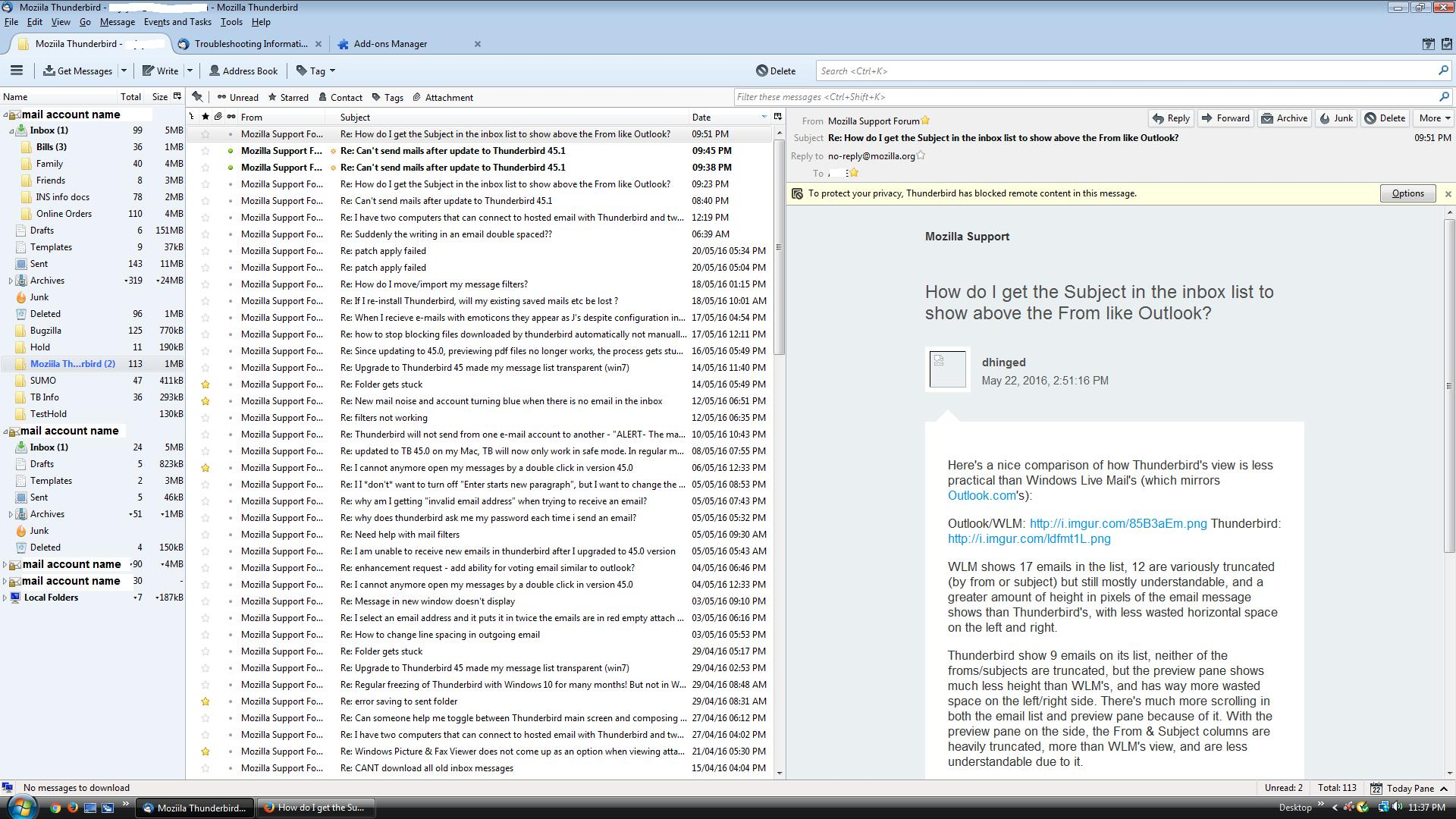
Here's a nice comparison of how Thunderbird's view is less practical than Windows Live Mail's (which mirrors Outlook.com's):
Outlook/WLM: https://i.imgur.com/hpLj75A.png Thunderbird: http://i.imgur.com/ldfmt1L.png
WLM shows 17 emails in the list, 12 are variously truncated (by from or subject) but still mostly understandable, and a greater amount of height in pixels of the email message shows than Thunderbird's, with less wasted horizontal space on the left and right.
Thunderbird show 9 emails on its list, neither of the froms/subjects are truncated, but the preview pane shows much less height than WLM's, and has way more wasted space on the left/right side. There's much more scrolling in both the email list and preview pane because of it. With the preview pane on the side, the From & Subject columns are heavily truncated, more than WLM's view, and are less understandable due to it.
Thunderbird really needs a view that shows subject/from vertically next to each other, as right now there's just less useful info on the screen and more scrolling or clicking all the way around no matter how you config it.
Modified by dhinged
Well I've used Thunderbird and Outlook when assisting mother and I have chosen Thunderbird because I can see lots more and have more options and abilities to alter most aspects.
It would seem you have not set up Thunderbird to work for you as the column headers seem to be very wide. The excess space indicated on left and right of Message Pane has nothing to do with wasted space and everything to do with how that email was produced using a fixed width for the text.
re :but Classic View takes away the preview pane
There is no 'Preview Pane' as this implies a preview which suggests the email has not been opened. As this is far from the truth, in Thunderbird it is called a Message Pane. The Message Pane is available in all views. A selected email using single left click, will be opened and displayed in the Message Pane. A double click will open in either a new tab or window depending upon selected settings.
Message Pane: It can be enabled via Menu icon > Options > Layout > Message Pane or toggle the view using F8 key. The top edge of the Message Pane can also be moved up or down etc as required. See useful info here:
All column headers can be enabled, disabled, moved left or right and column width can also be manually moved to suit the optimum.
I've just tried the vertical as you used this in Outlook. see image attached - this displays alot of info very clearly. Although I'm happy with Classic View which I can use on half screen.
The addon tool 'Theme font size changer' can assist with general font used in the UI, so making it larger etc. It is also possible to do this via userChrome.css, but that is another subject entirely.
Toad-Hall said
Well I've used Thunderbird and Outlook when assisting mother and I have chosen Thunderbird because I can see lots more and have more options and abilities to alter most aspects.
I've already proven with my screenshots that Outlook and WLM show more info and need less scrolling. BTW, I was on a standard 4:3 monitor (I thought you would notice) and you're on widescreen, which I'm moving to eventually and may make the problem moot (though on my current widescreen laptop, I'm still seeing less info in optimized Thunderbird layout than in the default layout of WLM/Outlook). There's no reason Thunderbird shouldn't offer the option to stack From/Subject, and I don't know why people would fight against that.
It would seem you have not set up Thunderbird to work for you as the column headers seem to be very wide. The excess space indicated on left and right of Message Pane has nothing to do with wasted space and everything to do with how that email was produced using a fixed width for the text.
I already explained why the column headers in Thunderbird are wide: I set the Layout to Wide View. The left and right space on the side of the message body is wasted because it could be used for showing more email list info and message body vertically rather than just sitting there being empty. Every email message body in WLM and Outlook show the full horizontal width (as Thunderbird does) but more vertical width which generally contains more content that's obscured by Thunderbird and requires scrolling.
re :but Classic View takes away the preview pane There is no 'Preview Pane' as this implies a preview which suggests the email has not been opened. As this is far from the truth, in Thunderbird it is called a Message Pane. The Message Pane is available in all views. A selected email using single left click, will be opened and displayed in the Message Pane. A double click will open in either a new tab or window depending upon selected settings.
The "preview pane" (a name that comes from Microsoft) is the pane that shows the message body; it's been called that in Microsoft products for a long long time (because it's different than the full email opened in its own window when you double-click it on the list in WLM), and is what I mean by the pane that shows the message body in Thunderbird. They behave *exactly* the same way.
Message Pane: It can be enabled via Menu icon > Options > Layout > Message Pane or toggle the view using F8 key. The top edge of the Message Pane can also be moved up or down etc as required. See useful info here:As I stated in my reply and showed in my screenshots, the pane is already enabled.
All column headers can be enabled, disabled, moved left or right and column width can also be manually moved to suit the optimum.
I never had nor mentioned a problem with not having all column headers enabled, nor with enabling or disabling or moving them or changing their width.
I've just tried the vertical as you used this in Outlook. see image attached - this displays alot of info very clearly. Although I'm happy with Classic View which I can use on half screen.
Vertical View was the default on my Thunderbird, and was what I wanted to change to look like WLM/Outlook so the subject/from were aligned vertically not horizontally. Classic View (like Wide View) shows the message pane below the email list but has the problem of showing less emails and less message body than WLM/Outlook.
The addon tool 'Theme font size changer' can assist with general font used in the UI, so making it larger etc. It is also possible to do this via userChrome.css, but that is another subject entirely.
That's fine that I can change the fonts, but they're already smaller than WLM/Outlook while showing less lines per view.