

An unwanted navigation dropdown button appears next to my hamburger icon when I view my site in Firefox, but not when I view my site in Chrome
I have a site with responsive code working well. On small screen widths, a hamburger icon appears as the link to the site's navigation. It works as it should when I view the page in Chrome.
However, when I view the page in Firefox an unwanted dropdown button appears next to the hamburger icon -- or sometimes it is a simple downward-pointing arrow. Whatever is, it gets added by Firefox.
The same kind of thing happens when the page is viewed in a smartphone or when it is viewed in a browser whose window is reduced to a narrow width.
Why is Firefox adding the unwanted dropdown nav and how can I stop that nav from appearing?
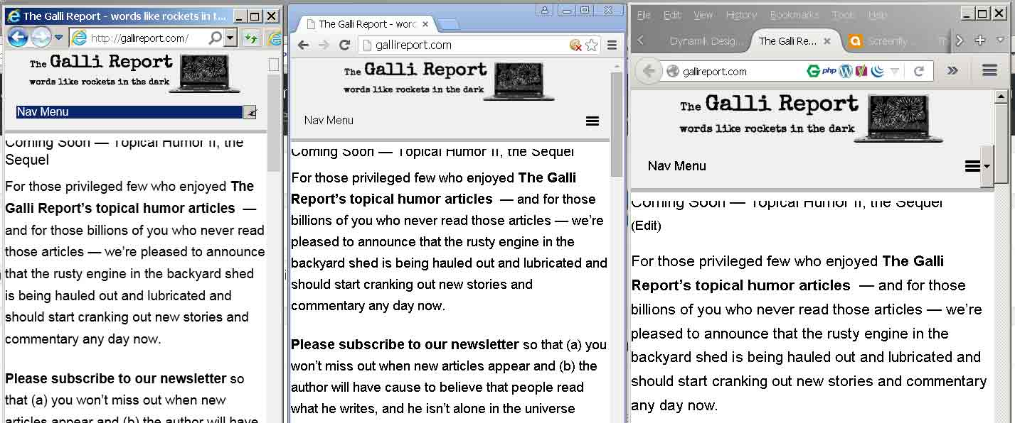
An image is attached showing the same page as served by IE Chrome and FF
すべての返信 (3)
Websites may switch to mobile mode if you reduce the window width below a specific value. I get the 3 bra button if the screen width is below 480px. Zooming a page affects the available screen width as detected via JavaScript.
You may have zoomed web page(s) by accident. Reset the page zoom on pages that cause problems.
- View > Zoom > Reset (Ctrl/Command+0 (zero))
この投稿は cor-el により に変更されました
In Chrome, you are using a proprietary property to suppress the standard drop-triangle for the <select> control:
(dynamik.css line 753)
.nav-chosen-select,
.subnav-chosen-select {
    background: transparent;
    border: 0;
    width: 100%;
    padding: 15px;
    cursor: pointer;
    -webkit-appearance: none;
}
On a hunch, I tried this in Firefox's Inspector and it seems to have a similar effect in Firefox:
-moz-appearance: none;
Do you want to try adding that to your CSS and see whether it works in real life?
You can also try -moz-appearance:menulist-text;